A Journey Through Text-Based Modern and Contemporary Art
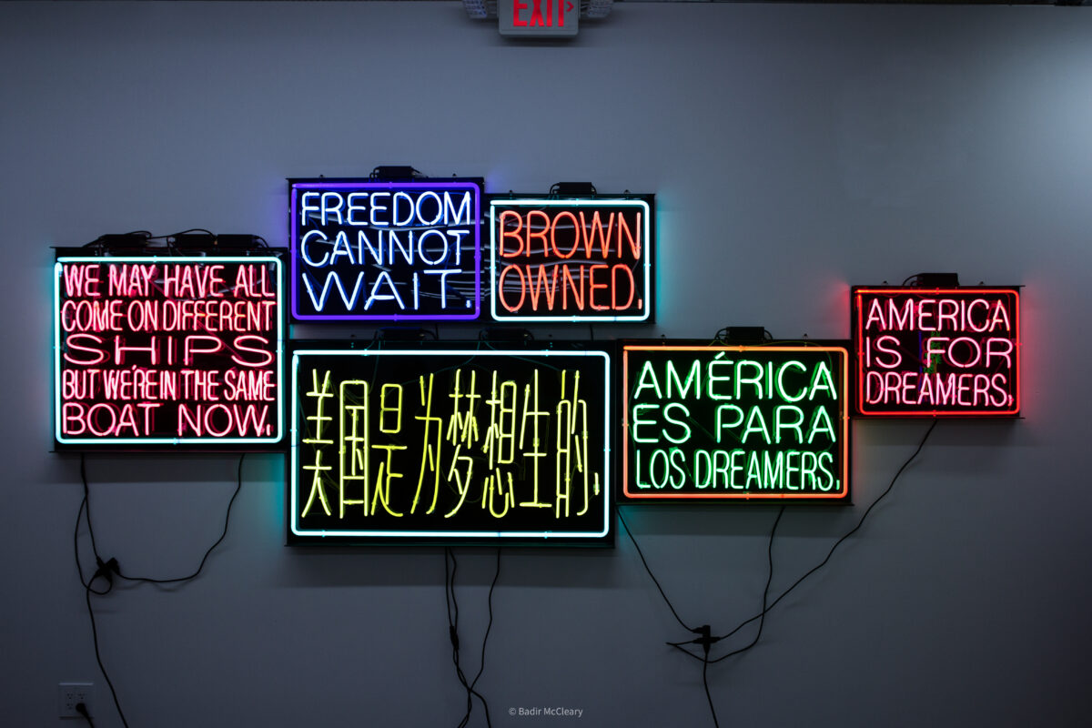
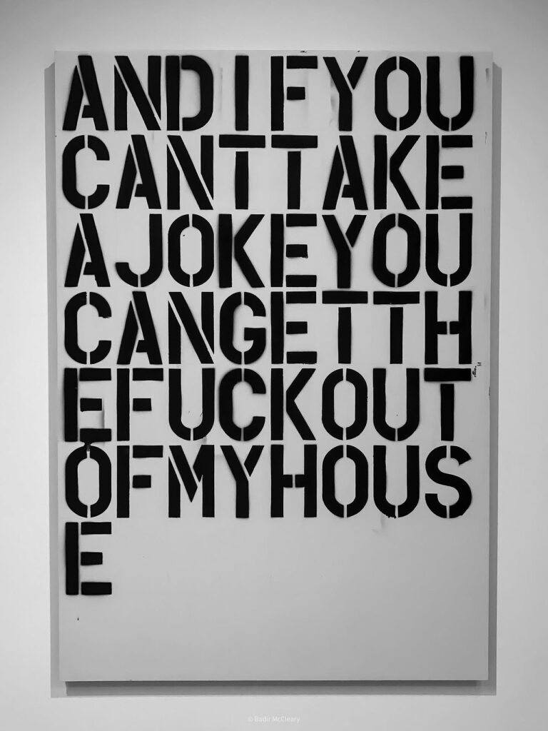
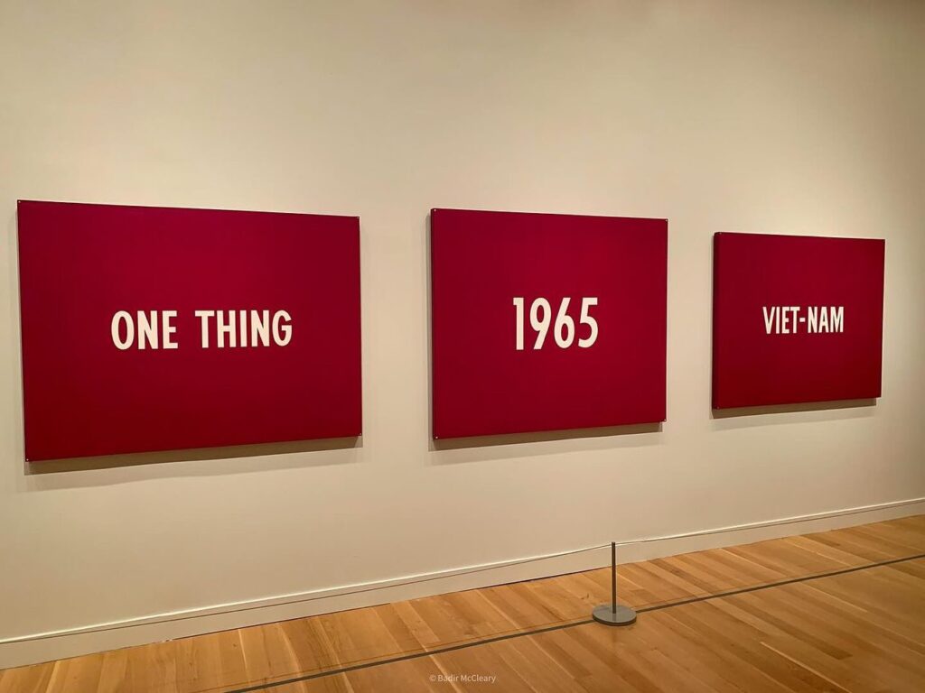
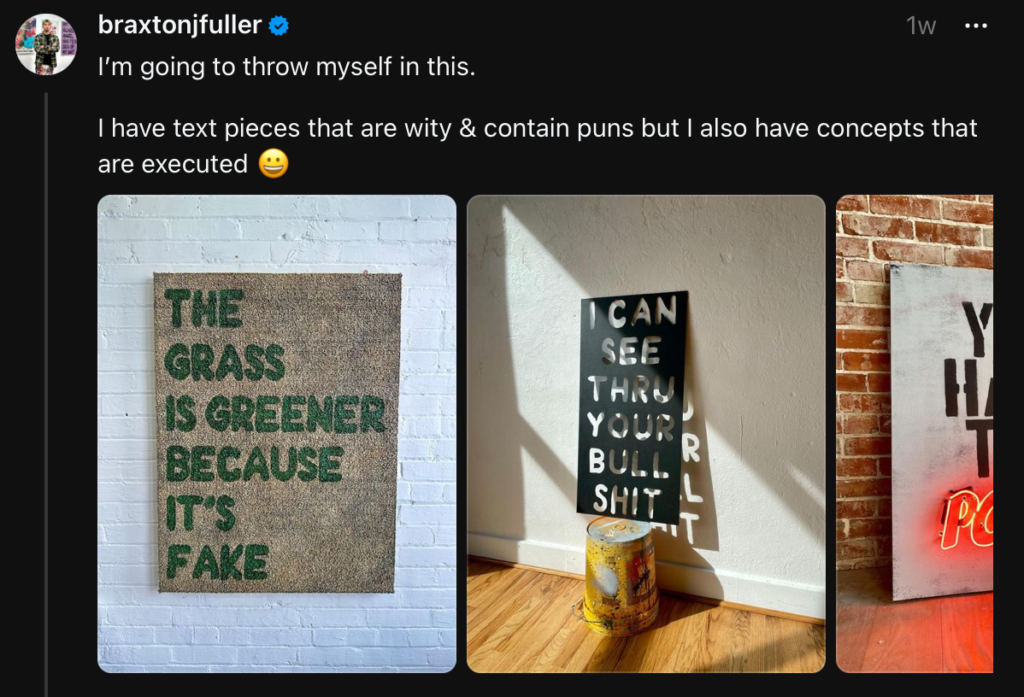
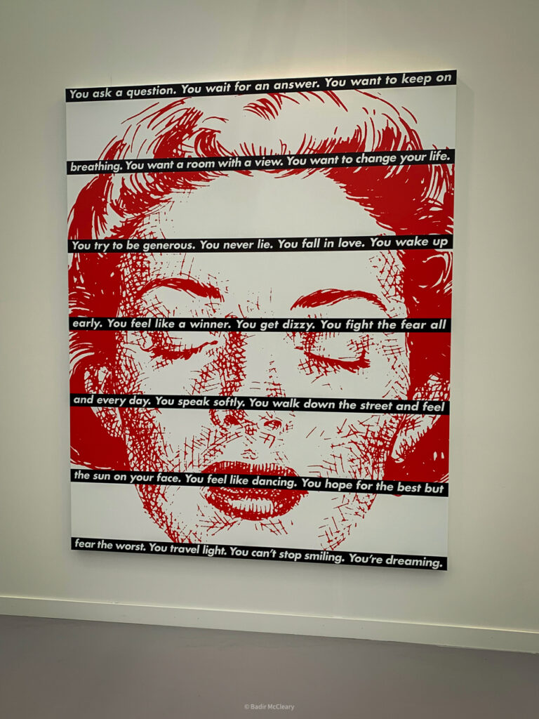
In December, I embarked on an intriguing journey, curating a threads conversation-style exhibition of text-based works from modern and contemporary art. It turned out to be more than just an academic exercise; it became a vibrant conversation among art enthusiasts. It was so cool that I figured that doing a different style or art period each month would be very exciting and educational for folks who want to discuss Modern and Contemporary Art! Let me walk you through this remarkable array of artists and their unique perspectives on text in art. We kicked off the month with Christopher Wool, On Kawara, and Glenn Ligon, who are iconic for their text-based puns and the historical significance of their work. They set a high bar for the exhibition, provoking plenty of thought and discussion. Interestingly, I made a conscious choice to omit Richard Prince, preferring to spotlight less predictable choices.
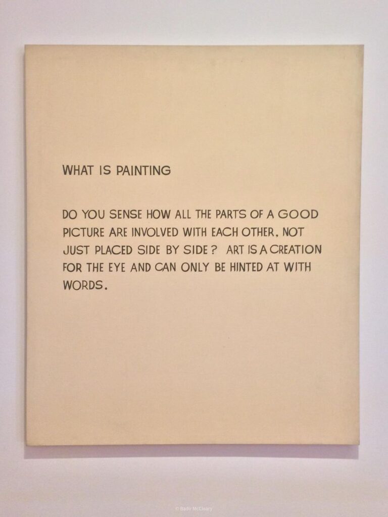
Then, I revisited a piece by Barbara Kruger, displayed at the Hirshhorn in DC. Kruger is known for her bold use of text to convey powerful messages, and she even had to defend her intellectual property against the likes of Supreme. This incident opens up a fascinating dialogue about the intersection of art, commercialism, and intellectual property. Moving on, I considered the works of John Baldessari and Ed Ruscha for their simplicity and profound impact. Baldessari’s “What Is Painting” (1966-68) is particularly intriguing, as it blurs the lines between text and imagery.
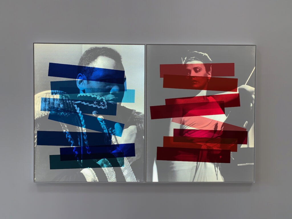
Glenn Ligon, Figure #76, 2011, at the Marciano Art Foundation.
Christopher Wool, If You Can’t Take A Joke, 1992.
John Baldessari, What Is Painting, 1966-68.
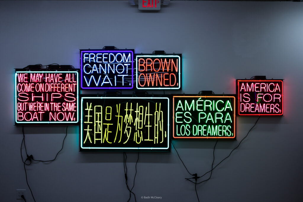
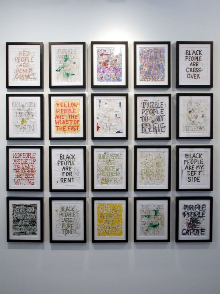
Jason Rhoades’s installations were also a highlight. Known for their neon lighting and humorous yet thought-provoking statements, one such work at Hauser and Wirth in Los Angeles exemplified the complexity and layered nature of contemporary communication. The exploration then turned to Pope L., particularly his “Skin Sets” series. These works use text to explore race, color, and labeling. Pope L.’s passing added a poignant note to our exploration, reminding us of the lasting impact of an artist’s work.
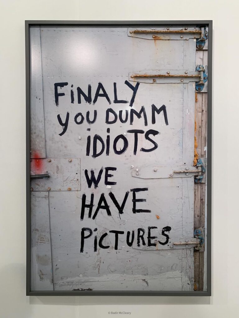
Sam Durant’s light boxes, seen at Blum and Poe, Los Angeles, brought a dynamic element to the exhibition. His use of bold colors and thought-provoking text creates an illuminating presence, akin to the city’s billboards yet distinctly more inspiring. Peter Holzhauer’s work, “Door” (2018), discovered at the Art Los Angeles Contemporary Fair, brought a sense of nostalgia and humor. The piece resonates with childhood memories, showcasing the playful and often mischievous nature of text in art.
Concluding the month, Patrick Martinez’s work was featured. Like Jason Rhoades, Martinez uses illuminated text, but his focus is more on community and local styles, creating a direct and impactful dialogue with the viewer. This virtual exhibition wasn’t just a showcase of artworks; it was a journey through the diverse and evolving landscape of text-based art. Each artist brought a unique perspective, challenging and enriching our understanding of contemporary art.
On Kawara at the Smithsonian American Art Museum, 2019.
Patrick Martinez
Peter Holzhauer’s Door, 2018, at Art Los Angeles Contemporary Art Fair, 2018
Jason Rhoades installation at Hauser and Wirth Los Angeles
Pope L.
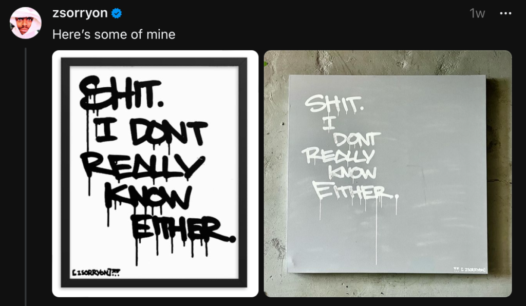
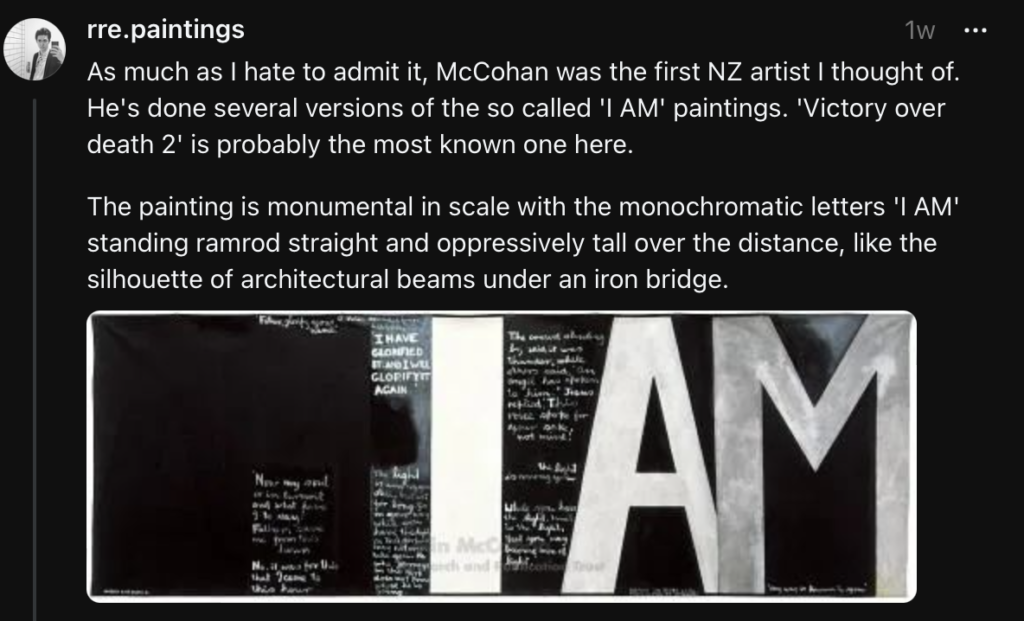
Here are some additions from some of the followers on Threads.
Happy Veterans Day! Here are a few artworks that highlight our servicemen.
Happy Veterans Day!
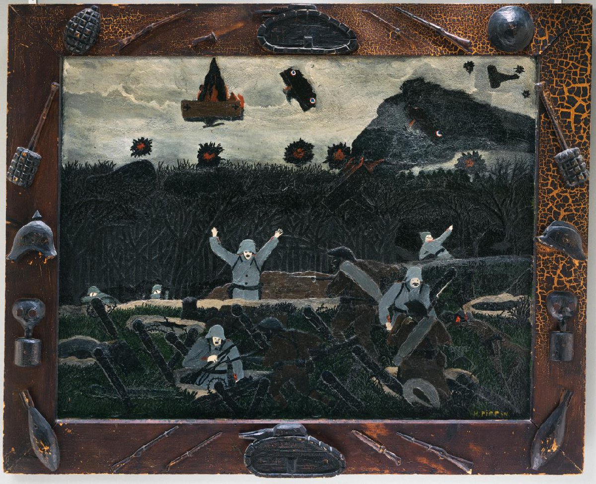
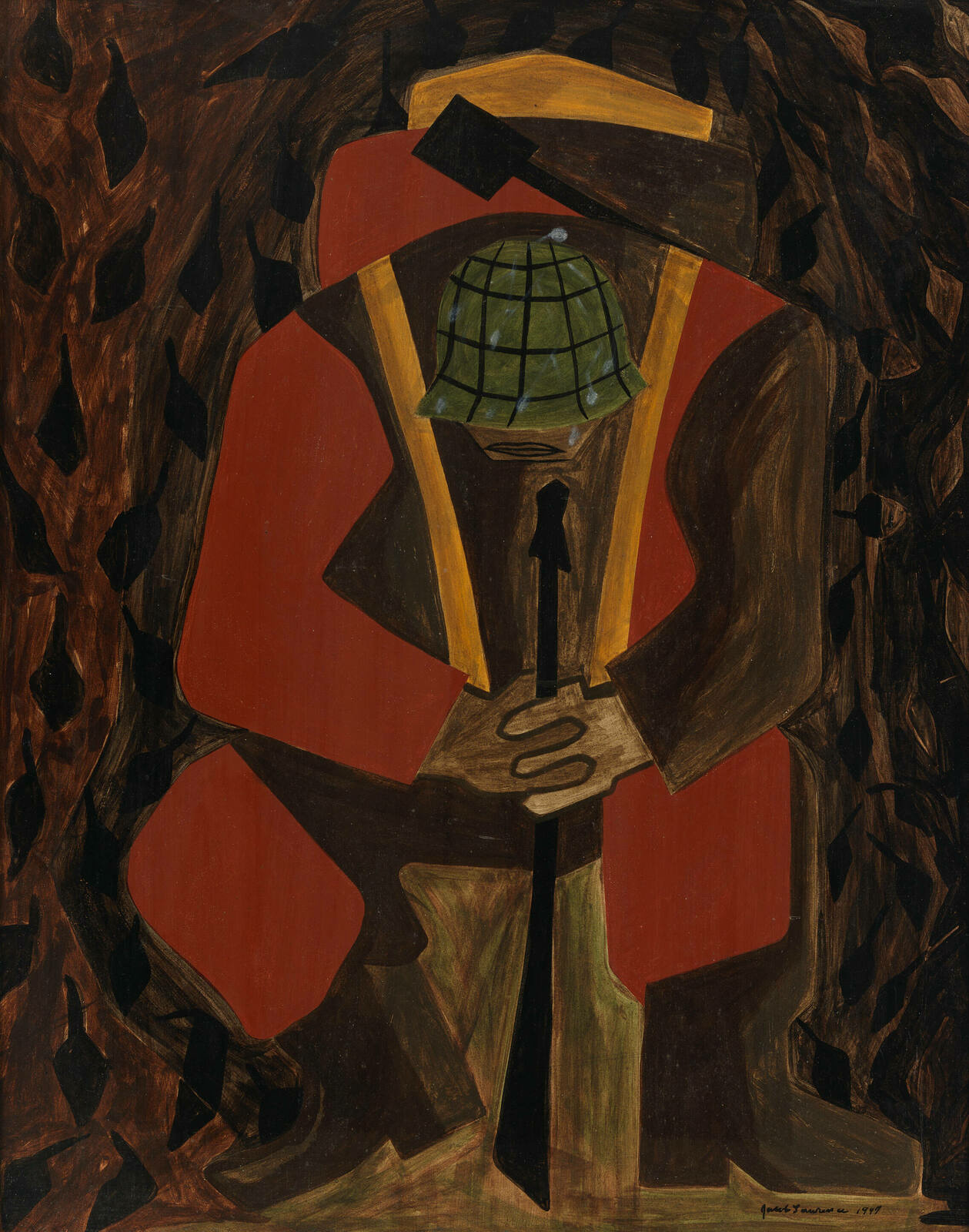
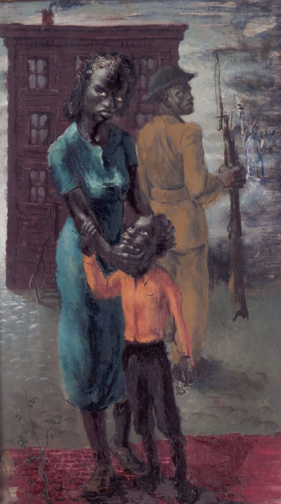
#HappyVeteransDay to all the Vets and thank you for your service! I wanted to do a quick reel highlighting some works that focus on the lives of our heroes. Many black artists throughout history were soldiers and many have contributed some amazing visuals to life at War and Home. These artists #HoracePippin, #JacobLawrence, #CharlesWhite, and #JohnWoodrowWilson have works that I felt were apropos for today’s reflections. What are some of your favorite works that highlight the sacrifices and triumphs of our soldiers?
Horace Pippin, American (1888 – 1946) “The Ending of the War, Starting Home” (1930-1933)
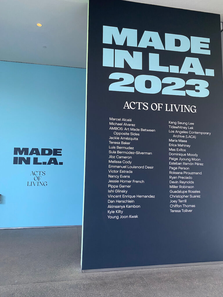
Made in LA: 2023 Acts of Living at the Hammer Museum
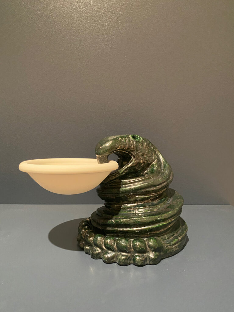
On a recent visit to the Hammer Museum, I had the chance to walk through the Made in LA: 2023: Acts of Living exhibition. This showcase featured the works of 39 local artists and collectives, offering a vivid reflection of the vibrant creative spirit that defines the City of Angels. As I strolled through the first gallery, specific works stood out with their remarkable presence, meticulous craftsmanship, and thought-provoking materials. Teresa Baker’s innovative use of yarn and artificial turf gave life to abstract forms that sparked contemplation about indigenous land authority through remapping. Adjacent to Baker’s creations, the functional design proficiency of Ryan Preciado aroused a sense of 1950s interior decor, emphasizing the intrinsic value of everyday objects in our society. Continuing the exploration led me to Erica Mahinay’s work, where painting, textiles, and sculpture blurred the boundaries between forms, creating a cosmic narrative that resonated with the intricacies of the human body. Jackie Amezquita’s installation of 144 slabs made from masa salt, rain, limestone, and soil sourced from 144 Los Angeles neighborhoods wove a powerful narrative of displacement and migration.
The late Luis Bermudez’s ceramic masterpieces, spanning over four decades, graced the gallery with their sacred symbolism and Mesoamerican iconography, including serpents and vessels. Meanwhile, Esteban Ramon Perez’s work engaged in a compelling dialogue between textile and sculpture, reimagining abstraction and pop culture through the lens of the material’s history. One of the most poignant moments was Roksana Pirouzmand’s creation, ‘Between Two Windows.’ This exquisite piece delicately captured the essence of long-distance relationships through migration, as one window symbolized her home in the U.S., while the other represented her grandmother’s home in Iran. As I continued through the galleries of the biennial exhibition, I encountered the captivating artworks of Tidawhitney Lek. Lek’s pieces, titled “Relatives and Refuge,” featured two distinct works that seemed to exist in a realm separate from the perception of their subjects. Michael Alvarez, on the other hand, drew deeply from his memories of family, commemoration, and familiarity as the foundation of his displayed artworks. His unique technique of blurring the paintings created a dream-like, ephemeral quality, underscoring the significance of cherished moments and relationships.
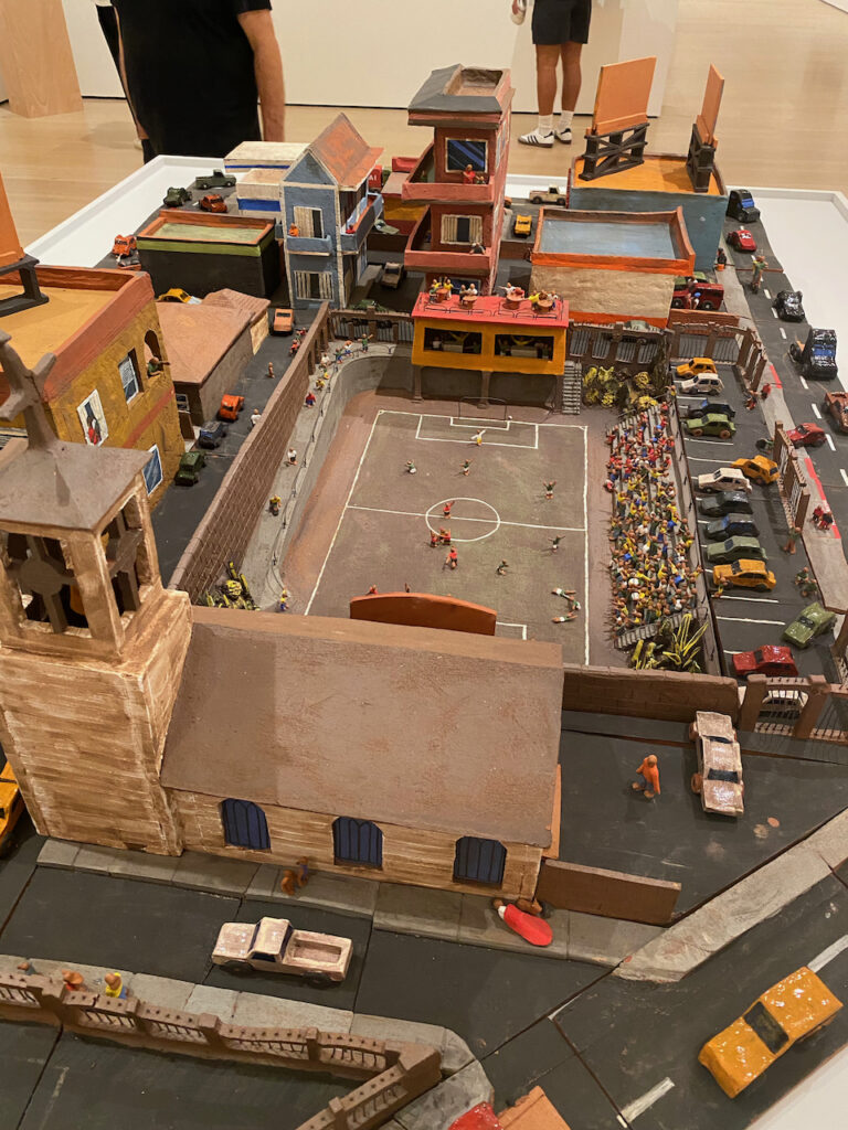
In a different artistic narrative, Joey Terrill’s works conveyed a figurative story akin to comic strips. These figures spoke to the queer community and were crafted during the challenging AIDS crisis of the 80s and 90s. Similar to Alvarez, Terrill used his art to immortalize the locations and individuals who profoundly influenced his life. Christopher Suarez, drawing inspiration from his Southern California upbringing, meticulously recreated a familiar thoroughfare in ceramic form. His tabletop installation featured buildings, automobiles, and sports fields, reminiscent of the style of artist Red Grooms. Paige JiYoung Moon, through her acrylic on wood panel works, offered a commentary on the city’s modest living spaces and meeting spots. With a fine brush and meticulous precision, Moon’s art reflected the creative adaptability required to thrive in the dynamic environment of Los Angeles.
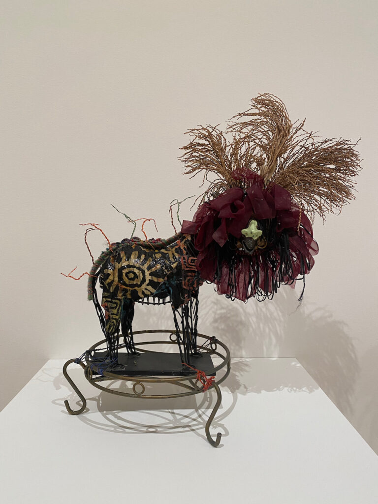
Dan Herschlein added an element of horror to the exhibition with his headless figures, intricately detailed within sculptural paintings. These works invited viewers to assume the role of intruders, presenting multiple perspectives and layers of architectural forms. Akinsanya Kambon employed clay as a vessel to unearth suppressed histories stemming from colonization. His clay plaques recounted stories of revolution, and his ceramic totems depicted past realities, all narrating the experiences of the African Diaspora. Teresa Tolliver contributed twenty sculptures from her “Wild Things” series, each based on the form of a lion. Each sculpture showcased unique attributes, emphasizing individuality within a formal framework. This collection served as a testament to Tolliver’s three-decade career exploring various artistic mediums. Sula Bermúdez-Silverman’s work titled ‘Theropods’ takes inspiration from claw-foot furniture. In Chinese decorative arts tradition, it is standard to see a dragon’s talons clasping an orb, symbolizing notions of strength and security. Through these sculptures, Bermúdez-Silverman invites us to reflect on the pervasive influence of social doctrines and cultural aspirations in the objects and art that surround us. Chiffon Thomas crafts sculptures and installations that blend elements of abstraction and figuration. Thomas often uses construction materials alongside casts created from the artist’s own body, portraying the human body in fragmented forms, combined with materials that have been broken, giving life to surreal figures.
Maria Maea intimately engages with her materials, crafting body-sized sculptures from a diverse array of organic and inorganic elements sourced from her home garden, urban lots, and the historically significant Los Angeles River. The palm, a symbol with deep roots in Samoan craft culture, symbolizes the resilience of those affected by colonization, who have adapted to thrive in challenging new environments. Guadalupe Rosales’ installation features a ceremonial sanctuary with an altar displaying a sculpture of the Mesoamerican deity Quetzalcoatl, created from materials inspired by lowriding and custom car culture. This piece symbolizes the fluidity of identity. Rosales explores the complexities of identity, challenges fixed cultural ideas, and harmoniously blends ancestral wisdom, personal memory, and contemporary experiences in her work. Art Made Between Opposite Sides (AMBOS) was founded in 2016 by artist Tanya Aguiñiga to address issues at the US-Mexico border through artistic collaborations. Their project, ‘With our hands we build deities’ (2023),’ uses clay hands created with asylum seekers in Tijuana shelters, along with embroidered talismans and personal stories. AMBOS employs craft mediums like textiles and ceramics to shed light on border politics while fostering a co-creative approach. This diverse array of artists and their works provided a rich tapestry of artistic expression, drawing from personal experiences, history, and a profound sense of individuality within the broader creative landscape.
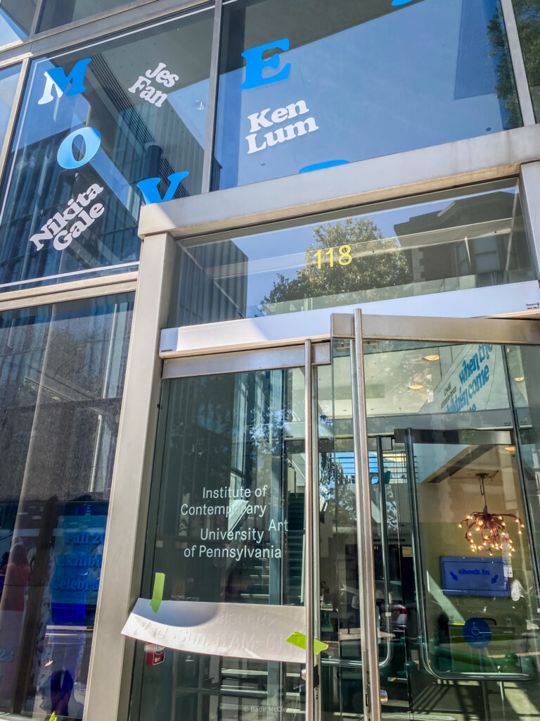
ICA-MOVEABLES Exhibition at ICA Philadelphia. 2023. Photo by Badir McCleary
Moveables at ICA Philadelphia
Moveables at ICA Philadelphia featuring Jes Fan, Nikita Gale, Hannah Levy, Ken Lum, and Oren Pinhassi.
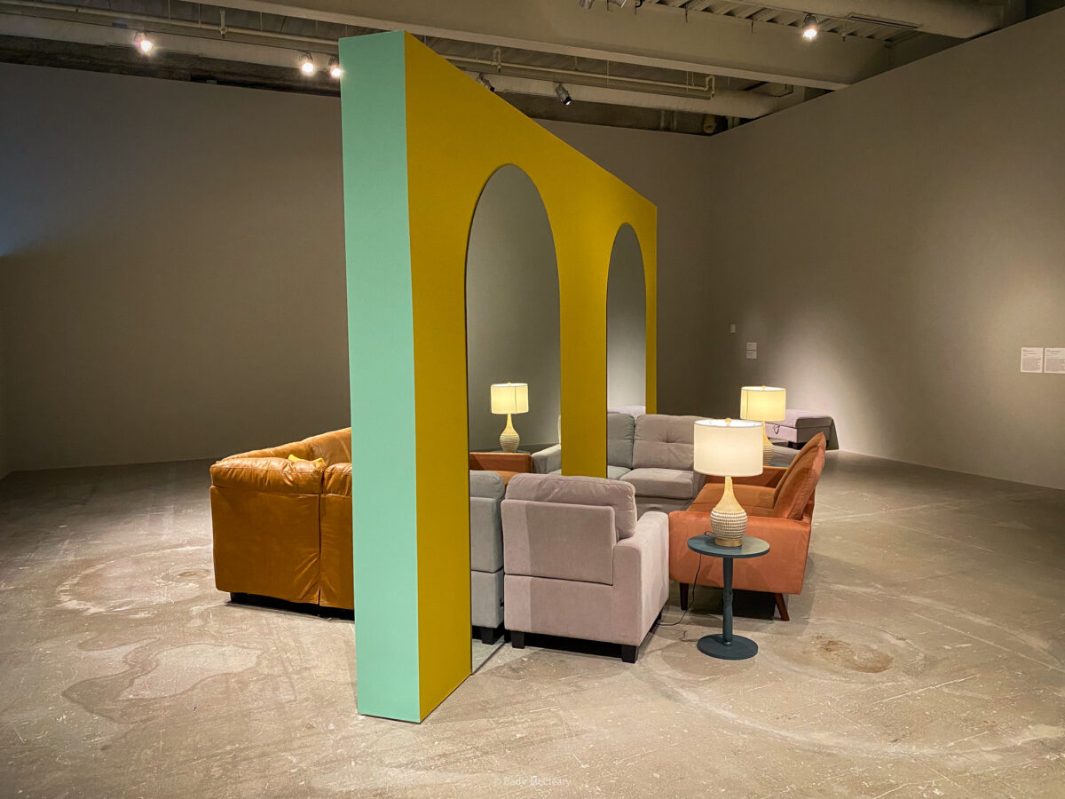
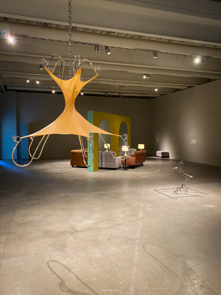
I recently visited ICA Philly to explore the exhibition titled “Movables,” featuring five remarkable artists: Jes Fan, Nikita Gale, Hannah Levy, Ken Lum, and Oren Pinhassi. These artists are reimagining functional design and its intimate connection to the human body. In the context of this exhibition, “movables” encompass any non-permanent articles within a building, such as furniture. As I wandered through the gallery, I couldn’t help but reflect on the idea that we, as visitors, are also “movables” in this space, constantly navigating to take in the diverse artworks on display. I found it intriguing how the exhibition’s press release failed to capture the depth of conceptual thought required to fully grasp and appreciate the artworks.
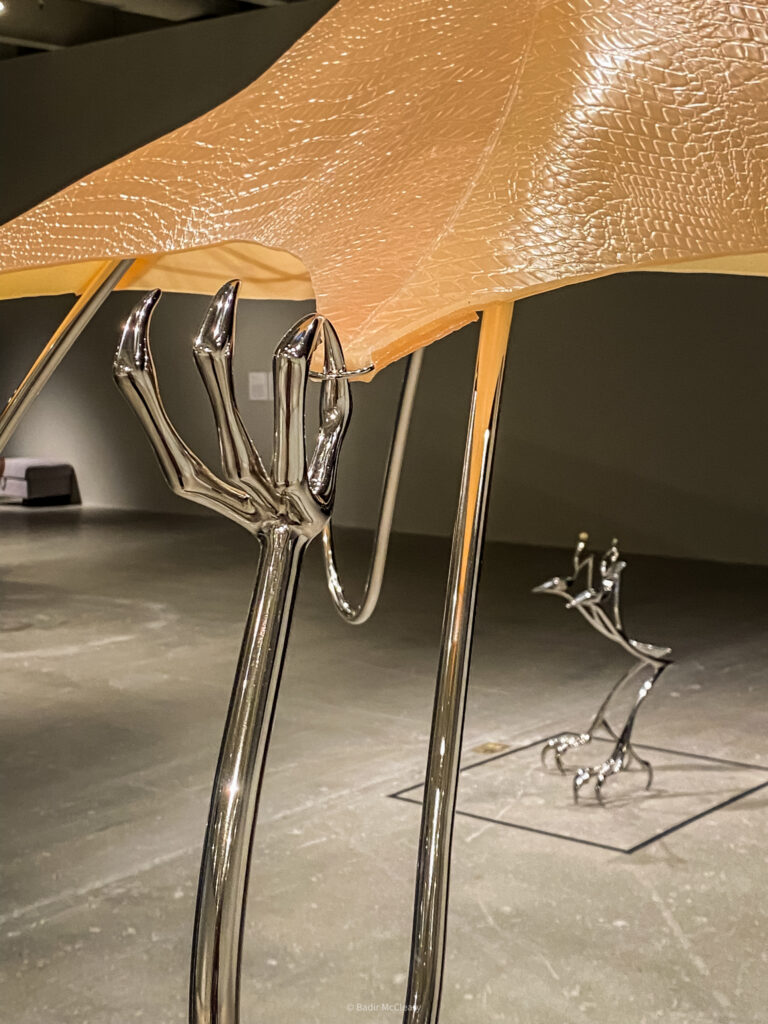
Upon entering the gallery, Jes Fan’s sculptural creations immediately caught my attention. They evoked images of precious gem-encrusted crustaceans, skillfully crafted and seamlessly blending into the surrounding environment, their forms flowing like liquid. Oren Pinhassi’s sculptures, crafted from sand, burlap, and plaster, transported me to a world where natural materials like earth, water, and fertilizer were the only tools needed for creation and growth. His work “Untitled, 2019” brought a smile to my face, as I initially mistook the green branch pads for mint leaves and the sculpture for toothpaste, only to discover its invitation to “oral activity.” His “One in the Mouth, Ine in the Heart, 2018” piece, composed of umbrellas, humorously represented being out of alignment, and the cup holder added a layer of whimsy, suggesting the collection of others’ problems.
Moveables at ICA Philadelphia featuring Jes Fan, Nikita Gale, Hannah Levy, Ken Lum, and Oren Pinhassi.
Moveables at ICA Philadelphia featuring Jes Fan, Nikita Gale, Hannah Levy, Ken Lum, and Oren Pinhassi.
Moveables at ICA Philadelphia featuring Jes Fan, Nikita Gale, Hannah Levy, Ken Lum, and Oren Pinhassi.
Hannah Levy’s sculptures conjured images of prehistoric bird traps with their fierce talon-like forms, juxtaposed against the gallery’s lighting. In “Untitled, 2021,” steel talons seemed to tear or stretch silicone resembling human skin, creating a captivating blend of discomfort and fascination. I regretted missing the performance associated with “Untitled, 2023,” as I imagined something epic involving steel heels. Ken Lum’s couch installation triggered nostalgic memories of childhood sleepovers and the excitement of assembling living room couches for acrobatics inspired by superhero films. The mirrors in the installation, a common fixture in many Black families’ homes in Philadelphia, added depth to the narrative. The setup, with one side promoting closeness and the other fostering individualized seating, subtly encourages reflection on familial bonds and the passage of time.
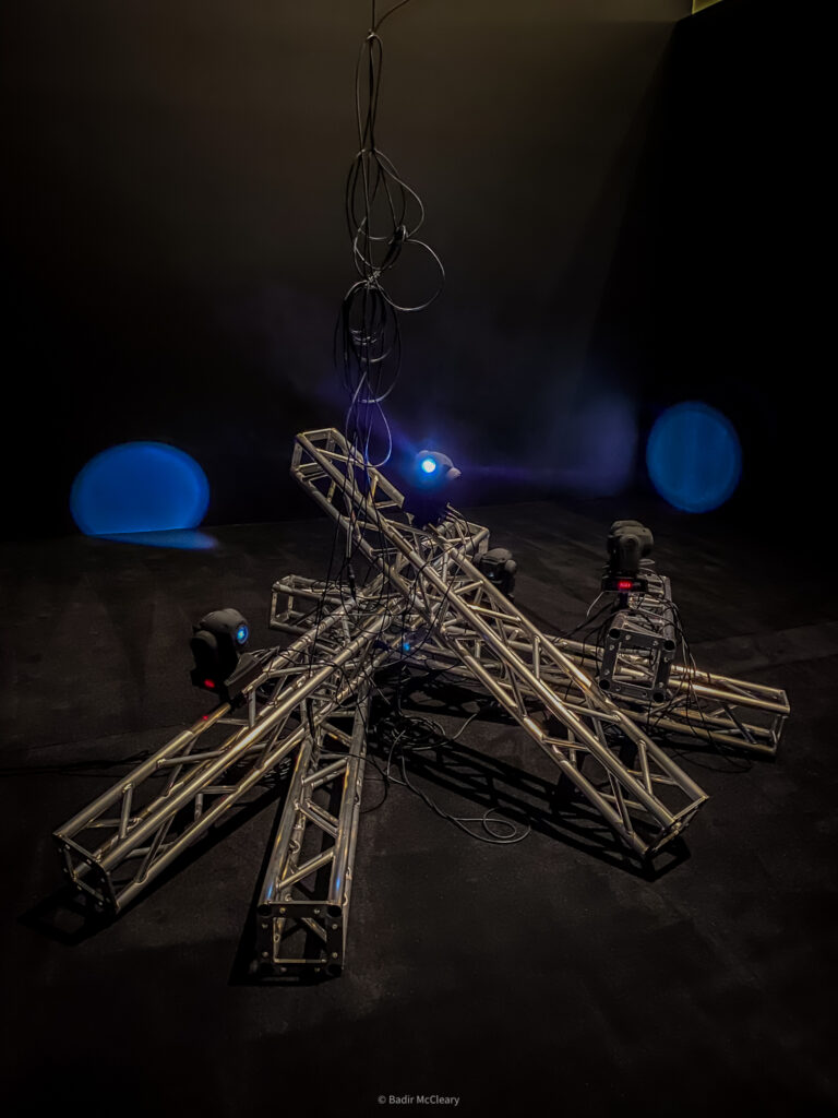
Nikita Gale’s work initially gave me the impression of being a production associated with the exhibition until a gallery attendant clarified its nature. During our conversation, we delved into the role of pop culture and the direction of light in selecting stars. It struck me how light, much like one’s time in the “spotlight,” moves swiftly—an allusion that resonated with Warholian sensibilities.
In conclusion, my visit to ICA Philly’s “Movables” exhibition was a thought-provoking journey into the world of contemporary art, where functional design intersects with the human experience. The artists—Jes Fan, Nikita Gale, Hannah Levy, Ken Lum, and Oren Pinhassi—each offered a unique perspective on this theme, leaving a lasting impression.
Words by Badir McCleary.
Moveables at ICA Philadelphia featuring Jes Fan, Nikita Gale, Hannah Levy, Ken Lum, and Oren Pinhassi.
Moveables at ICA Philadelphia featuring Jes Fan, Nikita Gale, Hannah Levy, Ken Lum, and Oren Pinhassi.
Moveables at ICA Philadelphia featuring Jes Fan, Nikita Gale, Hannah Levy, Ken Lum, and Oren Pinhassi.
What is a Portrait? Black American Portraits at LACMA
“I promise you the floor plan is nothing like the model” – Pusha T
What is a portrait? Is it just a snapshot of a face? A seizing of the moment of human expression? Or is it more? Many believe that portraits have a way of capturing a personality, a human essence if you will. Portraits are used to remember loved ones, honor distinguished citizens who gain honors through achievement and capture the emotions of a subject with an ability to extract feelings that arrest the viewer with their presence.
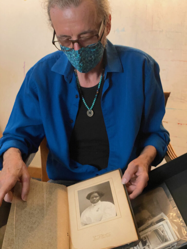
When I think of the term Black American Portraiture, I immediately see the images of Gordon Parks from LIFE Magazine, Howard Bingham’s iconic photos of a prime Muhammad Ali, or more recently, the portraits of artist Deana Lawson who unapologetically documents black life with an eye for consistency. More recently across the contemporary art world, black portraiture has become a hot item among top collectors and mainstream museums who jump at the chance to feature these works at luxury branded events and solo presentations worldwide under the guise of collection correction. This global focus on black portraiture and black figurative work sometimes feel like a collection of people all over again as the speed at which these works are bought and sold – sometimes returning very high profits for the seller – makes me feel a bit uneasy.
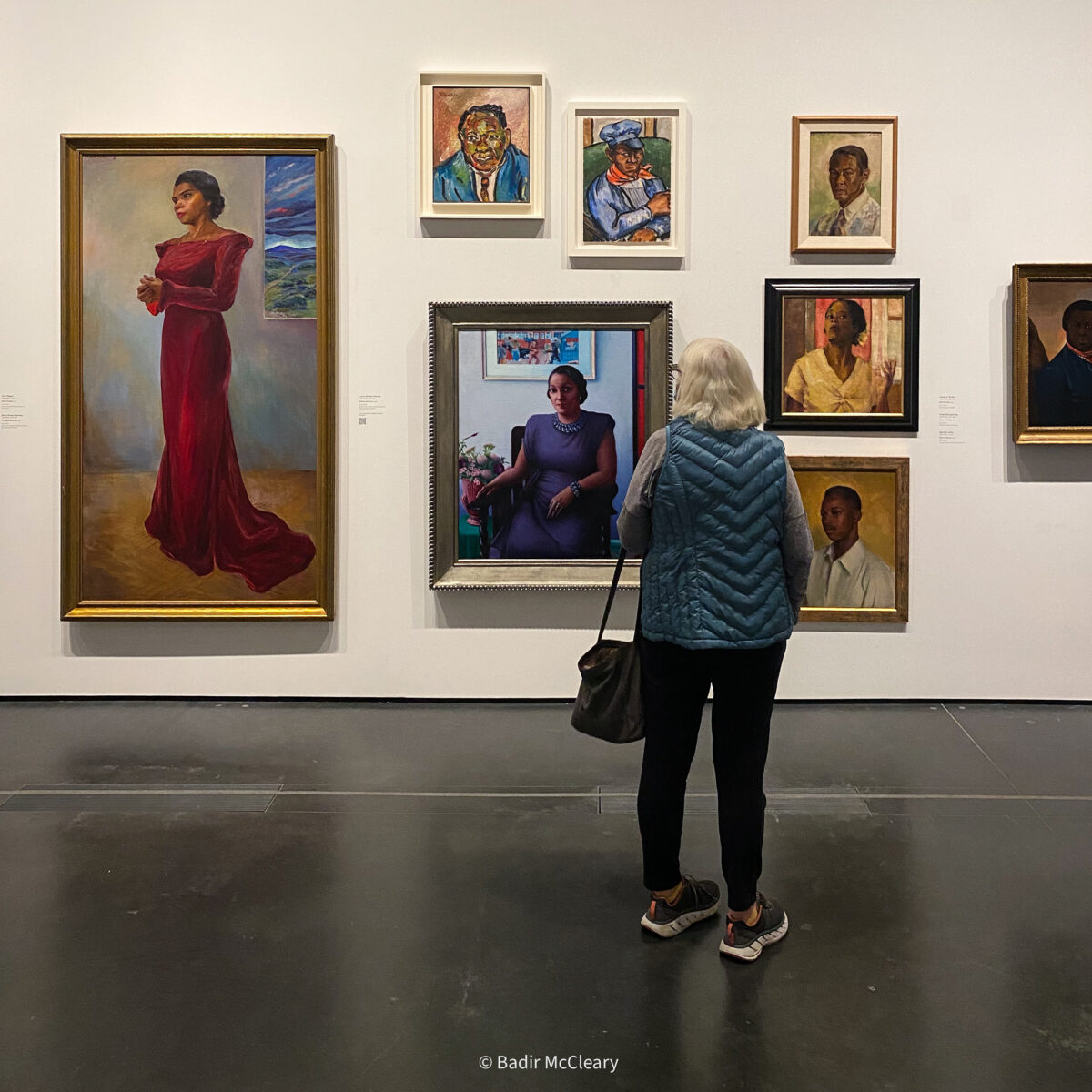
The exhibition Black American Portraits on view at the Los Angeles County Museum of Art is a collection of contemporary portraiture through a variety of mediums demonstrating the essence of its African-American subjects. This presentation was the last hurrah of the Curator of Contemporary Art, Christine Kim, who recently departed the museum for London and a new position at the Tate Modern. This show is a tribute to the late David Driskell, a well-regarded artist, curator, and pioneer for the arts who was the ultimate champion for the awareness, exhibition, and collection of black artists by institutions. His seminal exhibition Two Centuries of Black American Art, which took place at LACMA in 1976, was the first comprehensive survey of African American art. The participating works in the show were selected from the LACMA collection, local and international gallerists, and collectors whose holdings make them very important people when talks of donations, loans, and family bequeathments come about.
I arrived at LACMA’s campus excited, negative COVID test in hand, marching toward the Broad Contemporary Art Museum only to be redirected to the Resnick Pavilion. BCAM is usually the venue for major exhibitions on LACMA’s campus (even more lately since the construction on the expansion began) and I would think that an exhibition of this magnitude and relevance would carry enough weight to be housed in the building. Especially accompanied by The Obama Portraits, which were on tour from the Smithsonian National Portrait Gallery in Washington D.C. and were on view to the public in an adjacent gallery, showcasing the ultimate visitor attraction.
I had the same feeling about Los Angeles icon Bette Saar’s exhibition titled Betye Saar: Call and Response which was staged in a small and seemingly insignificant gallery space in the same building in 2019. I wondered – with such a breadth of work and being a hometown hero – why Betye Saar would be relegated to such a modest presentation? I hoped as I entered the Resnick Pavilion, that the Black American Portraits exhibition wouldn’t revive those same sentiments. As I entered, I was immediately met by the BLKNWS programming, an installation by Los Angeles-based artist and filmmaker Kahlil Joseph. The work is video-based content of current and historic events involving the African American community distributed across two screens that display or support the imagery on view. The content is regularly updated by the BLKNWS team and is truly a bright light in the public coverage of black people across the world. This work was unveiled with the Hammer Museums’ Made in L.A. 2020: A Version, but my first encounter with it was at Hank’s Mini Mart in Southwest Los Angeles and I fell in love with it instantly.
Black American Portraits features over 140 works in different mediums with hopes of examining African-Americans as subjects over the last two centuries. As I stepped into the gallery, I stood, I thought, out of the walkway to get an overall sense of how the exhibition should be approached and if there were any additional guides to help visitors navigate the multitude of works on view. I was eventually tapped by the museum security to move to the side because I was blocking the entry just a tad. (laughs)
I eventually found myself in front of the wall that displayed the crimson red exhibition title and statement, hoping to browse the selection with a sense of direction from the curatorial staff. There were a variety of starting points where one could begin their viewing experience. I wonder if that was the intent of the curator? Keeping the flow open and allowing the viewer to navigate the story in their way. Almost like the mind-bending albums of Grammy-winning music artist and Los Angeles native Kendrick Lamar, the starting point is wherever you decide to begin.
The paintings in the show are arranged in a salon-style with no upfront correlation or timeline. The portraits, seemingly grouped, feature images of blue-collared African-Americans in the workforce alongside sleek and sharp presentations of dignitaries and celebrities filled with color. I began with the portrait closest to the vinyl description which happened to be “Portrait of a Sailor”, a small (compared to other works on the wall) oil work showing a distinguished black man in a striking blue sailor’s coat and a bright red scarf resting comfortably around his neck. He is standing proudly in position against a backdrop of a sailing ship. The sailor looks with confidence as the clouds that shape the background give way to the impending storm, masking the beautiful sunset. The work was painted circa 1800 with a question mark as to whom the subject in the portrait is referencing. Researchers have the name “Paul Cuffe”, a businessman and sailor, as the subject in the painting. Even still with some doubt, as the original artist is not identified and probably no longer alive to even confirm it. The painting has an interesting history as its authorship has been in question for decades with Christie’s London first attributing it to artist John Singleton Copley in 1952.
In the first grouping of works, I was drawn to a painting by local art legend Dr. Samella Lewis with her portrait of Warren Kenner. Created in 1948, this oil work shows Kenner in thought, possibly sitting for the artist. Wrapped in a wood-like frame and highlighted with gold that seemed to illuminate the subject, it gave a sense of importance, maybe a familial or platonic relationship with the artist. Portrait of a Negro (Claude McKay), 1944 by Beauford Delaney, and The Conductor, 1941 by Charles Alston are very similar in presentation, showing black men posing for photos in what appears to be their work uniforms. I love the relationship of the works as they speak to African-Americans making their way into corporate America while still maintaining the challenging labor positions that help to sustain the country.
Leading the next group of works with a bounty of color are Portrait of a Cultured Lady, 1948 by Archibald Motley, Jr, and the portrait of the legendary singer Marian Anderson in 1944 by Laura Wheeler Waring. Both subjects are donning glamorous threads for their respective professions with a solid bold color (Waring’s Marian in Red and Motley Jr’s Cultured Lady in a deep purple) indicating strength, however, the works appear very soft and share the presence of parts of another painting (I wonder which artists?) alluding to their attention and participation in culture.
Following this group was a very profound juxtaposition of paintings and drawings and possibly the best combination of portrait placement in the entire exhibition. Sharecropper, 1943 by John Biggers, and Sharecropper, 1952 by Elizabeth Catlett sit atop this grouping and offer different gazes (male and female) of their subjects reflecting the veracity of black workers throughout history.
Thurgood Marshall, 1956 by Betsy Graves Reyneau along with Frederick Douglass, 1950, and Portrait of Tom Bradley, 1974 (The City of Los Angeles’ Mayor from 1973-1993) by the legendary Charles White rounded out this group of paintings. These works demonstrate the hierarchy and timeline of the growth of a people, paying tribute to the multitude of the African-American experience in the United States. From sharecropping to occupying seats on the Supreme Court, the work expresses the assimilation of African-Americans politically and economically, and the individuals whose efforts helped pave the way to equal inclusion in American society.
I do believe that the proper spacing and additional information would have enhanced the importance of each of these works. Seeing them individually with a concentrated focus would allow the context to be fully respected in conjunction with the artistic talent displayed. Although, viewing them together spoke to a narrative that sometimes goes underappreciated.
As I made my way toward the end of the first wall of the collection, I paused to enjoy works by Alice Neel (Horace Cayton, 1949) and Eldzier Corter (The Couple, 1949). Neel’s work presents Mr. Cayton, an activist, and journalist, seated in dark oiled tones of blue, black, and gray contrasted by a colorful green, orange and yellow tie. Demonstrating a no-nonsense approach, Neel captures Cayton as an attentive but gentle man, legs-crossed and ready to tackle stories head-on.
I started to feel that as I got closer to the end of the first wall there was a constant fight for my attention. I focused on Benny Andrews’For Colored Girls, 1977, as I am a huge fan of his multi-fabric-infused canvas works. They excite my idea of subjects reaching out and touching the viewer, even if it’s only just an illusion. In For Colored Girls, he continues that practice as his subject – an older woman – sits in a fabric-covered chair with a tweed hat, next to a group of flowers that match the orangish-red strokes in her dress. Her blouse, seemingly made of canvas, hangs off the shoulders as it would if the woman were right in front of you, adding more concentration to the importance of threads in the subject’s life.
Resting above Andrews’s work was Betye Saar’sPhrenology Man with Symbols, 1966, and Jacob Lawrence’sThe Studio, 1996, which reminds me heavily of Derrick Adams’ work with its diametrical shapes that form human compositions.
David Driskell’sJazz Singer, (Lady of Leisure, Fox), 1974 seemed to be somehow hidden amongst the other paintings even though its size would have you think otherwise. I’ve recently started to appreciate the work of David Driskell after researching more on his contribution to the history of black collage and the role it plays in storytelling. He was incredibly instrumental in shaping the narrative around black visual identity in fine art. I’m excited to explore his career and work further in forthcoming writings.
As soon as you turn away from the David Driskell work you are smacked in the face with the coolest work in the whole show. Photo Bloke, 2016 by Barkley Hendricks is a beautifully bright, salmon-shaded work featuring a black male – dressed in a similar salmon suit – properly highlighted through Hendricks’s knowledge of the hue spectrum. This painting shows the enjoyment in the life of “Getting Fresh” and feeling good. Growing up in Philadelphia, I’ve always admired the cool of Hendricks’s images as youth continuing into adulthood. I am truly taken aback by the nostalgia and the accuracy in the translation of each of his works.
The Hendricks piece shares a wall with three massive works by current contemporary art powerhouses. I guess the curatorial team wanted to make a statement within the artist hierarchy as these three artists, Amy Sherald, Kehinde Wiley, and Mickalene Thomas have towering works that unabashedly declare them as the stars of the presentation. It almost makes Barkley Hendricks’s work feel like President Abraham Lincoln on Mt. Rushmore, present but almost insignificant. Sure, you’re there, but are you really?
Amy Sherald’sAn Ocean Away, 2020 is the first piece you meet of the “Big 3” and for me, it was a very familiar one. I had recently seen this work in Amy Sherald’s solo show Amy Sherald: The Great American Fact at Hauser and Wirth Los Angeles less than a year ago. It had already reached the floors of a prominent institution. Resembling a couple’s summer trip, Sherald reintroduces the viewer to her palette using levels of gray as skin tone for her subjects. It delivers a stark distinction against the bold hues of the surf gear, surfboards, and saturation of earth colors of sand and sky in the background.
In the center, we have Portrait of Mickalene Thomas, The Coyote, 2017 by Kehinde Wiley. A portrait of the artist Mickalene Thomas as a keeper of wolves in the night. I think Kehinde wanted to show the fierceness of her character as the painting has a very potent presence unlike the visible softness of the Sherald work. The portrait of Mickalene Thomas’s wife, Racquel Chevremont in The Inversion of Racquel, 2021, reminds me of a shiny UNO Card or an old flier I pulled out of my grandmother’s drawer. It’s made of oil and acrylic paints with rhinestones that shimmer against the wood panel. Its composition is undoubtedly familiar with Thomas’s oeuvre as it recreates a very reflective feel of black women in commercial advertisements in the 1970s.
Across from the introductory wall includes a myriad of stories through the works. Reframing the past and reclaiming historical narratives, these works focus on figures of advancement and awareness even amongst turbulence. Genevieve Gaignard’sTrailblazer (A Dream Deferred), 2015, shows variety in the “the look” of blackness in the art world. In the work, in which she is the subject, she stands proudly under a tree holding a framed painting of Rev Dr. Martin Luther King, Jr. and former President John F. Kennedy, both of whom were assassinated at the heights of their activist and political careers. Renee Cox’sThe Signing, 2017 introduces a constituency of Afro-futuristic renaissance posed portraits merged into a single frame reimagining black people as the purveyors of a new reality. Could this be a rethinking of the signing of the Declaration of Independence? But this time, signed by black people?
Atop these works is a piece by Titus Kaphar titled Enough About You, 2016, focusing on a young black youth first hidden in the original version a painting flanked by a majority of white men. In Kaphar’s version, the youth is emphasized by a gold frame accentuating his now importance and silencing, if only for a moment, the chatter about the “greatness” of the white men that surrounded him. The canvas seems to be hardened by a chemical that allows the crumbled form to take its shape and permanently places the black subject in the center of the conversation. Mixed in between are works by Lezley Saar (daughter of the aforementioned Betye Saar) Of a bed of night iris shredding pedals one by one, like the hours of darkness, 2020, Umar Rashid (Yolanda, Lady of Yerba Buena, 2015) and Whitfield Lovell (#3, (After the Card Series), 2009).
Issac Julien’sSerenade (Lessons of the Hour), 2019 plays well with Renee Cox’sThe Signing, 2017 as it could appear to be (even though it isn’t) a focused shot of some of the members in preparation for that photo. The still is from Julien’s beautifully directed film with the same title and prominently ponders on the life of abolitionist Frederick Douglass.
We come across Kaphar again with Behind the Myth of Benevolence, 2014 which features the image of a young woman, probably Sally Hemmings, the slave and bearer of a child (or children) of Thomas Jefferson. Appearing behind the hanging canvas as the portrait of Jefferson is slowly stripped away, she reveals herself likely nude, hinting at the covered crimes of slave masters. I appreciate the explanation by Kaphar in an earlier interview I read on the digital art website CultureType, in which Kaphar explains the work. He clarifies that it isn’t solely about Hemmings but “a symbol of many of the black women whose stories have been shrouded by the narratives of our deified founding fathers.” This work excites me every time I come across it as I believe it is a brilliant representation of a mix between sculpture, painting, and education.
I loved that Behind the Myth of Benevolence, 2014 is positioned next to Biddy Mason, 2006 by Elizabeth Colomba. The portrait appears sepia with its color scheme but is strong in its message as it presents Biddy as a regal figure, dressed in a black suit or robe. The light shines through her window as an indicator of her importance to a bright future for her people. Mason was a California entrepreneur and philanthropist whose leadership and deeds went highly underappreciated throughout history because of her sex and skin color. These works, like the earlier presentations of the Delaney and Alston paintings, show the growth of the black worker from sharecropper and slave to a noble leader.
In the center of the room sat the more three-dimensional portrait works. Sargent Claude Johnson’s Chester, 1930, is a bronze sculpture with the facial bust of a man with a hand, presumably his own, resting on the right side of his face. The look feels of submission or approval, maybe at a loved one. Allison Saar’sSledge Hammer Mamma, 1996, is almost three feet in size and takes human form with its fists balled as if it’s ready to take on all comers. The supposed feet of the sculpture have the shape of a sledgehammer which I took to indicate that the power is in the movement, placing one foot in front of the other. The sculpture has visible nails that have been hammered into its frame for stability but also maybe to demonstrate that it’s taken its lumps. Probably explains why it’s ready to fight. Richmond Barthe’sInner Music, 1956 is a bronze sculpture highlighting the profile of a nude black man, possibly a dancer because of the way he is posed. I wonder if this is the artist’s interpretation of a mixture of elements with Michaelangelo’s David and the Venus de Milo by Alexandros of Antioch? Barthe’s work is undoubtedly something else on my list I’d love to look more into.
Tavares Strachan’s Enoch, 2015-17 is a very interesting project from the LACMA Art + Technology Lab grant recipient as ENOCH brings awareness to the story of Robert Henry Lawrence Jr, the first African-American astronaut selected for the space program. The work takes the royal stance of a sarcophagus but physically takes the shape of a vase or urn. The project was realized through the launching of a 3U satellite with the help of sponsor SpaceX. Augusta Savage’s Gwendolyn Knight, 1934 is a casted homage to her mentee molded in clay and cast in plaster. Knight’s likeness is very firm and feminine showing the maidenly softness of the artist but also the materials of the work speak to her ability to stand firm in her beliefs. I read that not many of Savage’s works are in existence because of minimal funding for bronze casting. Artists are constantly prohibited because of financial burdens. Some things never change throughout time.
Standing away from the sculpture crowd and greeting guests who took the scenic route through the exhibition, was Karon Davis’s Ishmael, 2017. From the collection of UTA Artist Space director Arthur Lewis, Ismael, 2017 is a plaster-based representation of a young boy in a confident stance. It reminds me of the “Fearless Girl” bronze statue by Kristen Visbal on Wall Street in New York City. I love Davis’ plastered sculptures as they feel as if someone is still molding on the inside and their remarkably replicated features, especially the eyes in this work, make me question if Ishmael isn’t still in there.
As you spin around the wall, you find yourself entering the section mostly devoted to photography (there were also a few photos outside of it like but this was majority photo-based). You are welcomed by vivid images that display the gaze of the black photographer. Upon entering the space I was met by a vertical trio of photographs led by Ralph Nelson’s black and white portrait of former President Barack Obama in Untitled (Obama in Mirror, B&W), 2009. I was immediately intrigued by this photo as I see two sides (figuratively and literally) of the former President. The silhouette posterior of the President appears strong, solid, and unwavering while in the anterior shot he appears calm, eyes closed in submission, a subtle entry into the personality of Barack Obama.
Below the Nelson portrait sat a bursting ray and stripes signifying the noise from the horn of Charlie “Bird” Parker in Rico Gaston’s, Bird, 2015. This portrait of “Bird” is miniature in comparison to the bands that overwhelm the composition, almost questioning if the work is about the rays or the legendary musician. At the bottom of the trio sat the work of Deborah Willis and her son, artist Hank Willis Thomas (whose collaborative work Sometimes I See Myself in You, 2008 is also featured in the gallery) depicting almost mirror images of a singular male subject, one being Thomas himself, is reminiscent of a previous familial moment. I’d like to think that the male in the first image is Thomas’ father and the second image is a “Like Father, Like Son” moment where the mother as photographer adores the likeness of her kin.
One of the most prominent pieces on the wall almost directly on the other side of his previous work is Isaac Julien’sThe Last Angel of History, 1989/2016 from his Looking for Langston Vintage series. It focuses on a young man dressed in a wing-fitted costume holding a photo of Langston Hughes on a scroll. The photo is very dramatic as if the angel is using the image to represent something he is either answering or demonstrating. Maybe the angel was before God and pleading for the entry of the late poet into heaven?
My absolute favorite photos were of Laura Aguilar,Clothed/Unclothed #34, 1994, and Carrie Mae Weems,Untitled, 1990, from Weems’ kitchen table series. These works spoke about the embracing characteristics of love and family. Showing different scenes of affection – the husband and wife’s interaction in Weems’s work and the father embracing the children in Aguilar’s work – demonstrates different types of love generating the same feeling of comfort and security. Weems’ work also contains a text panel that waxes eloquently about love in the late summer and sets the tone for understanding the history of the love story on view.
I also got a glimpse of works from legends Lorna Simpson (Backdrops Circa 1940s, 1998) and Arthur Jafa (Monster, 1998, Printed in 2017) which shows a young Jafa posing with a menacing look at the camera. In the photo, I can’t tell if that is his hair or the shadows amongst the ceiling but it adds more of a deranged look which may be led to the title.
Deborah Willis’sLiving Room Picture Stories, 1994, has photos of what looks like family members in the fabric of the work. This quilted creation reminds me of the term “fabric of our lives” often mentioned in commercials and promotional material about moments. It brings to mind the episode of the TV show Family Matters where the younger granddaughter Laura mistakenly sold the family quilt at an art exhibition. It brought awareness to me of the importance of quilting and what it means to the black community and the history of passing down memories and familial information through knitting.Bisa Butler’sForever, 2020, a vibrant textile-based representation of the late actor Chadwick Boseman, is one of the best. She gracefully translates the images of her subjects into soft, comforting cloth illustrations. I was fascinated by her exhibition at the Art Institute of Chicago which showed the diversity in imagery and consistency of the material in an array of her pieces. Kerry James Marshall’s Black Beauty (Tyla), 2012, is an extremely muted portrait of a black woman softly lit with a bluish hue illuminating the features of her skin, the shine in her earrings, and parts of her shirt. I liken this photo to his paintings which exhibit the dark hues of his figures giving a lesson on the many shades of black.
The gallery also features a collection of gelatin silver prints by James Van der Zee (one of the first black photographers I’ve had the chance to learn about as a youth) including Self-Portrait in Boater Hat, c. 1925, which features the artist donning a derby-style boater hat and a striking black suit. Other works of Van der Zee on view include Marcus Garvey & Garvey Militia, Harlem, 1924, Crowd in Harlem, 1929, Atlantic City, 1930, and Daddy Grace, Harlem, 1938, which shows a man dedicated to a spiritual message with his hands up in submission inside of a place of worship.
Kwame Braithewaite’sUntitled (Clara Lewis Buggs with Yellow Flower), 1962, printed 2020, and Untitled (Carolee Prince Wearing Her Own Designs), 1964, printed 2018 are by far the calmest works in the gallery. The way Braithwaite uses bold color as a way to accentuate his subjects is masterful. Both photos feature eccentric hairstyles and objects of scene definition in addition to the models which help to complete the photo. The objects also do an amazing job of contrasting color as it presents a beautiful offset that intensely drew my focus.
The space also contained editions from Lorraine O’Grady’s famous “Art is…” photography series featuring images (Art Is… (Man with Rings and Child), Art Is… (Nubians), Art Is… (Man with Baby), Art Is… (Unisex Barber Shop), all 1983, printed 2009) from the Harlem African-American parade in 1983. O’Grady’s mission was concentrated on capturing the neighborhood people inside of a golden frame. One of the largest and best iterations of participation art I’ve ever seen. I love seeing the multitude of photos with different scenes each time this work is on view. I find something soothing about them.
Following the O’Grady works are a collection of works whose relationships are stunning. Deborah Willis and Hank Willis Thomas’s forenamed Sometimes I See Myself in You, 2008 reminds me of the classic Source Magazine cover that featured the Death Row records team of Suge Knight, Dr. Dre, and others dressed in all black to make their bodies seem invisible over the emptiness of the black background. Willis and Willis Thomas recreate that moment with a twist. The image presents three portraits. On the left you find Thomas and on the right you find Willis. The portrait in the middle is a mash-up of both of their photos showing the similarities in the gene pool of the family. It’s striking as the features are almost exact but for a few exceptions.D’Angelo Lovell Williams’ Daddy Issues, 2019 shows an arm-wrestling match between two black males, possibly father and son, exercising the age-old duel of old versus new. It’s very interesting because the arm wrestle first starts as a handshake (just as the men are positioned in the photo) but can easily turn into a tussle. Not always physical, but mostly egotistical.
Tourmaline offers an arresting conversation with Swallowtail, 2020, as she engages the audience through the lens of Black-Trans liberation using her self-portrait to elevate ownership of identity. I read an interview with ArtForum where she speaks about “not leaving one’s self out” and reevaluating the practice to also include her journey in the narrative. Todd Gray’sMirror Mirror, 2014, displays an image of a young black child obscured by a circular photo frame containing a red, orange, and black flower. The child can be seen holding an image that is also hidden by the photo frame. The crack of the wall structure, or possibly an overhead shot of a cracked surface on the ground, add striking earth-toned cool to the image allowing the flowers’ colors to take center stage in the artwork.
A vitrine in the center of the space contained late 19th-century Albumen silver print photographs of unidentified black people sitting for the camera. Some are very small and in beautiful personalized frames, while others are preserved very well and show the postures of families, children, and businessmen of the era. One of the prints, the larger of them, is of the world-recognized abolitionist Frederick Douglass by George Kendall Warren in 1876 – on loan from the National Portrait Gallery.
Before you exit the room, you’re introduced to Barrington and Father, 2021, by the aforementioned Deana Lawson, which shows a father and son – dressed in the styles of their respective generational trends – showing how fashion has changed over the years. Even though trends change, both men remain consistent with the fashions that embody who they are. We all know a few elders in the black community that just won’t let the gators and purple suits go. (laughs) I’m a huge fan of Lawson’s photography as her study in hard-hitting naturalism of contemporary black life always seems to stop me in my tracks with its intimacy.
Paul Mpagi Sepuya’sDarkroom Mirror Study (Ox5A1525), 2017 I believe should’ve been the opening image to the works in this part of the exhibit. This image focuses solely on the camera – the instrument that initiates and records moments of our lifetime – as it sits on a tripod in the portrait position with the artist’s hand as a stabilizing and guiding assistant. This image is relatable to every photo in the room as each artist has undergone the song and dance of photography during their practice and production of their respective works.
Xaviera Simmons’Sundown (Number twenty), 2018, is more of a photo of a moment. It shows a side profile of the artist holding an ancestral mask in one hand and a printed photo of a black man being pulled from a train by white attackers in the other. The portrait, in this case, is the mask, and the photo is a representation of the constant portrait of racism that continues to plague the world.
The Martine Sims video work Still from Notes on Gesture, 2015 drove me insane (laughs). I am a fan of Sims’s video performance creations but this piece and its audible reach throughout the gallery gave me PTSD and I’m sure parents of small kids were triggered as well. I understand the meaning of gesture recognition, it is truly important to comprehend culture, especially in the black community, but there has to be some consolation for those who grew up with these (laughs). I felt as if I was back at my family’s home surrounded by little cousins and nieces and having to listen to them constantly bicker and repeat the “word of the day” from social media. I tried to tune it out on every visit home, and inside this exhibition, but unfortunately, it never works. The video’s constant repetition also drew ire from the visitors as well as many who heard the work before they saw it, making their engagement with it very minimal. One lady was completely miffed by it, asking if it could be turned off. (laughs)
Kenturah Davis’A Question Only Answered With Another Question, 2019, is an oil portrait with a painted figure that appears shadowy and creates an aura around itself through swift movement. The artist creates this effect through transparent touches of the oil and rubber stamping. The process is a fascinating one as Davis sometimes includes messages in the work that once repeated on her preferred canvas reveal figures – many times of the artist herself or friends. Jordan Casteel’sJordan 2020, is a self-portrait in a pinkish hue of the artist sitting calmly in sweatpants on her couch. The main component of the painting (besides the subject) is the pillow that she’s leaning up against as this provides a step away from the dominating hue to provide a vivid burst of coloring centering the work. You also can’t help but notice her collection of books that are on the shelves and the plants that are resting in the background representative of growth and knowledge.
Rafa Esparza’sBig Chillin with Patrisse, 2021, I initially thought was a portrait of MCA Chicago curator Jamillah James, a leading art professional and former curator at ICA LA where Esparza had his solo show “Rafa Esparza: De la Calle”. The show included works in the adobe practice of the artist which I truly enjoyed. This portrait made of acrylic and adobe depicts a black woman lying comfortably on what seems to be a balcony, restfully looking at the viewer, welcoming a heartfelt conversation. Clifford Prince King’sSafe Space, 2020 is an intimate portrait photograph of three black queer men relaxing, grooming, and enjoying each other’s company. It centralizes on one main figure who is receiving a drag of smoke from one of the men holding a joint while braiding the third man’s hair as that man reads a book. The men are seen sitting, lying, and resting against a mattress on the floor of an apartment space, exhibiting the care and candor of black queer relationships.
Kim Dacres’ No my first name ain’t baby, 2020, stems from the harassment of women being catcalled. Made of rubber tires from cars and bicycles, Dacres recreates the bust of a woman with beautiful translations of the hair and accessories. Dacres’ practice is reminiscent of the work of artist Chakaia Booker which combines similar materials in production creating large public art. Dacres’ approach is very subtle in comparison to Booker but doesn’t lack force as the work shows she’s nothing to play with, and her first name surely isn’t “Baby”.
Woody De’Othello’s Blank Faced, 2020, reminds me of a teapot or a funnel that contains the filtered water that gets delivered to homes and offices (laughs). It appears to have a set of ears adding personality to the object. The pot rests or is affixed atop a shiny blue ceramic stool as an honor for its years of use. The ceramics shine with a glaze that reflects smoothly off of the gallery’s lights showing all of the grooves and digs in the finished product. Simone Yvette Leigh’sStretch Series #1, 2019, shows the glazed stone signature eyeless sculpture with a raised neck reminiscent of African tribe women. I love how sleek her sculptures are and the exclusion of the eyes in her work to me represents a template for the voice of all black women. Her work is very sturdy and present, a testament to the will of the black woman.
I remember the series of works that Glenn Kaino’s, The Invisible Man (Salute), 2018, stems from. A version of this sculpture (or sculpture like this) made its debut during Art Basel Miami Beach in 2016 at Collins Park in Miami, FL. The public version of this sculpture features the figure with both its hands raised, referring to the “Hands Up, Don’t Shoot” cries that went viral after the murder of Michael Brown in 2014 by Ferguson, Missouri police officer Darren Wilson. The work is a double-sided mirrored silhouette of a figure, with its right hand raised in the black power salute. A portrait that has been heavily reiterated during the social unrests of the country in the last few years.
The final walkway of the exhibition felt very cramped. This is where the salon-style curation went into overdrive and you could feel overwhelmed by the amount of work on the wall. Taking a step back, it felt as if there was an overflow of potential choices for inclusion and instead of going through the process of elimination, the curatorial staff let the ocean just flow. Like the famous meme of Oprah, “You get a space, you get a space, everyone gets spaces!” (laughs).
Kohshin Finley’sEssence and Jihaari, 2020, is a grayish oil portrait of California African American Museum Visual Arts Curator Essence Harden and her husband Jihaari, embracing in front of what looks like their family home. The painting is very nostalgic as the oil adds a smoothness to the portrait that reveals the couple’s expressions, clothing, and atmosphere. I love Finley’s realism in portraiture as he seems to capture the true expression of his subjects with a personal connection between the soul and his brush.
Glenn Kaino’s (Salute (Second Salute), 2019) is a framed golden bust of a gloved fist with the black power salute depicting Olympic medalist Tommie Smith’s iconic moment at the 1968 summer games. The work has an infinite reflection speaking to the multitude of participants in the continuous fight for justice.
Shepard Fairey’sJohn Lewis: Good Trouble, 2020, was created in the traditional screen print style made famous by the presidential campaign of Barack Obama. Fairey paints a portrait of a youthful John Lewis, the Georgia politician, and activist, who was on the front lines of many of the protests and uprisings of the civil rights movement. Lewis also served in the House of Representatives in the State of Georgia before his passing in 2020. The work is very consistent in branding with many of Fairey’s screen printing projects as he combines red, gold, and a light teal color that can be seen interspersed throughout the work. It also features a quote by Lewis alongside newspaper articles about the “Melee at Selma” in which he and a host of protestors were attacked by local police. Another headline reports on African-American citizens risking their lives for the right to vote in 1964. What a wild time in history that seems to be having a reboot.
Immediately under the Fairey piece, was a work by artist and Black Panther Party member, Emory Douglas with The Black Panther, vol. 2, no. 25, March 9, 1969. The artwork is an ink-on-paper illustration of a young boy selling the Black Panther’s newspaper with a rifle strapped around his back. The newspaper has a front-page headline reading “All Power To The People” prominently in his raised hand. The bright orange of the page invites the urgency of the task at hand and grabs the attention of the viewer instantly.
Calida Rawles’In His Image, 2021 is a hyperrealistic painting of a black male resting comfortably in a pool of water with his body semi-submerged and his face pointed at the sun. The bluish-green hue of the water dominates the painting, almost dipping you in the water with the male. The skin seems eerily real, almost as if you can touch it. The artist illuminates the essence of the subject making it appear photographic and not touched by a human hand. I am truly enamored with the way that Rawles paints water. It’s as if you can sink your hand directly into her work. I remember being blown away by her water-based works in her solo show at the Various Small Fires gallery space in Los Angeles in early 2020. This is most certainly one of the most sophisticatedly painted pieces in the exhibit.
Fulton Leroy Washington’s Shattered Dreams, 2020 portrays the late Kobe Bryant gazing sorrowfully at the viewer. Wearing a navy blue hoodie with Lakers purple highlights that gleam against the black background, tears made of basketballs can be seen pouring from the eye of the hoops legend ultimately forming a scene of Bryant shooting a jump shot. Washington places cracks in the frame of the late superstar that contain symbols of the city of Los Angeles and the fatal crash site – you can see the smoke rising behind his head – with an indication that Kobe’s death rattled the world like an earthquake. The artist reveals an opening in the skull of Kobe Bryant showing a family portrait exemplifying what was always on his mind. Family. Rest in Peace, Kobe.
When I laid eyes onNumbers and Faces: Multi-Racial Ethnic Combinations Series 1: Face #7. Eduardo Soriano-Hewitt (Black/Filipino), 2020 by Charles Gaines, my first thought was “Is that Tupac?”. There seems to be a merging of many faces of numerous races and at the end of it, it somehow looks like the late Los Angeles-based rapper and activist Tupac Shakur (laughs). Gaines carefully numbers and paints the trajectory of his work on acrylic sheets bringing to mind the paint by numbers style that is usually found at paint and sip parties. The acrylic sheet that the work is painted on summons thoughts of the light bright game from the 1980s where you would place colorful pegs on the light board and create your method from a set of prearranged plans or a custom design. Gaines has perfected this technique and puts it on display in this piece focused on facial combinations and forms to create a singular result. You can see a consistency in the eyes, nose, and mouth of each face but you witness the differences in the subjects when you look toward the top of the head and notice that the hair changes with its color assignment.
Jake, Our Best., 1978-83 by Sam Doyle, is a painting of a man named “Jake” (of course) painted on metal in regular house paint. Doyle’s work recorded the life and times of the Gullah people of Saint Helena Island in South Carolina. “Jake” is posed in the manner of a fighter/boxer, in a fighting stance, but he is holding what looks like a baseball in his right hand. Could Jake be a pitcher? He is dressed in a blue jersey with the initials T.G (or T.B.), brown trousers, a backward hat, and high socks which could convey that he is playing in a cricket or baseball game. The text “Jake, Our Best.” sits atop the subject in white and the work starts to look like a baseball card. Maybe Doyle was looking to create his version of the iconic Honus Wagner baseball card.
Henry Taylor’sShe Is Not A Ho, 2005 is a depiction of a young black woman sporting a white blouse with a hand – of what appears to be a man – gripped around her waist. The scene also includes a figure extending an extra-long arm to pour liquor out onto the road (a ritual in the black community for paying respect to a lost loved one). The most interesting part of the painting is the hidden white face at the top right, which was almost impossible to see in the gallery with the work installed way above a visitor’s eye height. The work also draws reference to Rene Magritte’s The Treachery of Images, 1929 – which is also in the LACMA collection – as Taylor adds the signature pipe and quote “Ceci n’est pas une pipe (This Is Not A Pipe)” to the piece as a form of “meta messaging”, hinting at the unfavorable perceptions of the woman. She is NOT a ho, no matter what you think of her bringing clear that the images we see of people don’t always reflect who they are.
Jonathan Lyndon Chase’s butt naked dressed in pearls, 2018 is a mixed media painting that confused the hell out of me. For real. (laughs). It shows a sketched assortment of naked bodies (perhaps men) that are trying on pearls and makeup in a scene of probable grooming. This conclusion was reached by observing pearls and the set of hair clippers that are seen in the bottom right of the scene. The figures are made up of gold and tannish paint and outlined in black, the only actual way you’d be able to recognize a figure in the work – besides a few nipples, the lipstick, and painted circles that cover the anuses of these figures that the artist emphasized throughout the scene. The heavy layering of the gold paint at the top unites with some of the formations, while they sit on what’s presumed to be a purple carpet or mattress. The purple also makes an appearance at the top, blending into the faces of two of the formations. The gold could also be seen in the hair of the figures highlighting their wave-inspired hairstyles. There are two watches in the artwork – not attached to any of the subjects – and five painted lemons (with the outline of a sixth) that threw me for a loop. The artwork could be seen resting against the wall while sitting on three styrofoam doll heads which in my opinion put the already undesirable salon-style curation of the show on an even thinner ice with the presentation.
Sadie Barnette’s (Untitled (Dad, 1966 and 1968), 2016) are portraits of the artist’s father showing his duality as a United States serviceman and a member of the Black Panther Party. Her work caught my attention a couple of years ago when she included her father’s FBI file in an installation that talked about government surveillance. I think she is doing an important duty by reframing the narrative around her father and other black men like him that have had their reputations ruined by unfortunate circumstances placed on them by governments.
Deborah Roberts’, Breaking Ranks, 2018, is a paper collage portrait mash-up of faces forming a young girl wearing a tiara. The child has two sets of arms and hands, one set being the hands of Rosa Parks from a mugshot photo, reiterating the collective trauma passed through history. What draws your eye, other than the number 7053 from the mugshot addition, is the contrasting patterns of the clothing that she’s wearing. Red and white stripes lay calmly under an orange and tan blouse along with a square patterned skirt that exudes the multiple personalities of the collaged subject.
Instantly under Roberts’s work is Chelle Barbour’s Portrait of Madame C.J. Walker, 2018-19, a mixed media collage with the most identifying characteristic being a new set of eyes over the face of Madame Walker. The creation also contains a set of hands holding the hot comb, a symbol for Walker’s industry that she founded. Barbour also adds a cluster of lids from hair product cans that almost look like pennies until you examine them tighter. Her status is also accentuated by the purple bouquet in her hair and feather-based attire. The pennies seem to work as well and maybe even better because Madame Walker was bringing in the coin.
Barbour and Roberts contribute two different approaches to collage work as both have roots based on futurism and realism. Roberts draws on historical conversations that engage the viewer to remember and research. In Barbour’s practice, her futuristic medley of images invites the viewer to reimagine and dream the impossible.
I thought that Kehinde Wiley’sYachinboaz Ben Yisrael II, 2021 could’ve been the perfect complement to Bisa Butler’s piece if curated in proximity. It would have been an intriguing conversation with each other. Wiley’s signature floral oil-based painting presents a young black man fitted with a cane in a pose of a knight or noble. As in many of Wiley’s works, that floral arrangement conquers the painting and gives the sense that the figure is emerging from the flora. The man is dressed in a very modern style which Wiley uses to relate the current feelings of joy and promise that are in black men. I love the sentiment behind his work as it shines a light of positivity and a feeling of growth and future, especially in times where the visuals you see about us are often non-progressive. The exuberance of color and the celebration of their subjects almost mirror one another and are especially reflective as many young men (like those in Wiley’s paintings) strive to achieve their dreams at great heights as Boseman had before his untimely passing.
Dr. Samella Lewis’sBag Man, 1996 has probably the best backstory story of all the works in the show. This painting was the second version of the work which Lewis made out of frustration after her request to borrow the original for a show was declined by the collector. Now that’s boss. I wonder how many times that’s been done in today’s art world? This wood-framed oil work shows the image of a worker dressed in overalls with a brown and red mix. His eyes look behind him as he hauls a yellow sack on his back. The painting is set against a solid blue with slight hints of green filled with thick brushstrokes almost jumping out at the observer. Before reading about the work, I wondered if the man had left home or work, or maybe he was just down on his luck with nowhere to go. Upon further investigation, I learned that Lewis was inspired by her memories of trash pick-up men and the social injustices of folks who struggle in the streets. Living in Los Angeles, this work touches on the heart of a growing issue in the city. I love it more each time I see it.
Tatiana Fazlalizadeh’sNayyirah and Rachel, 2010 is an oil-painted portrayal of queer love (that I felt would’ve gone perfectly with a few of the other works in the show – like the Clifford Prince King work) that features two black women in an intimate show of affection. The woman in the foreground is bare and covers the woman behind her who is also presumably nude, at least in some way, as you can see the blues of what appears to be a dress in the bottom left corner. The woman in the background wears a rose in her hair and kisses the shoulder of the woman in the front while she looks directly at the viewer. I love how the artist uses a presence of light (maybe recited from a reference photograph?) as she extracts the contrast of the different shades of brown in their skin. The rose in the hair of the woman in the background adds softness against the power of the dominant colors of the white background and the brown tones of their skin. I feel the nudeness is them baring their truth to the world and solidifying it with a kiss that symbolizes the love and trust that she has for her “protector”. Fazlalizadeh is known for her larger-scale paste-up work of charcoal-based drawings that are then printed on an extensive scale and pasted around streets and businesses across the country.
Otis Kwame Kye Quaicoe is among several Ghanaian-based painters being recognized for their practice in portraiture in today’s contemporary art market. The painting, Lady on Blue Couch, 2019, is overpowered by the assertive orange of the dress, the cool blue of the couch, and the lime green that rests on the wall behind the figure. The subject has a gray skin tone that matches the somber look on her face. She is accented by a set of pearls on her neck and wrist and one earring that is visible within the hairstyle.
Lauren Halsey’s The Crenshaw Hieroglyphic Project: Exterior Wall (featuring Frankie Beverly), 2018 is an exterior wall panel of the proposed structure for the Crenshaw Hieroglyphics Project set to be installed soon by Halsey in Los Angeles. Images carved into gypsum panels depict a group of four women and a man, highlighting their hairstyles – looking like the style choices when you go to a barbershop or hair salon. The word “MAZE” is prominently carved into the t-shirt of another subject that’s missing a head (maybe to be revealed on another panel). Scratched into the panel was the text “Featuring Frankie Beverly”, referring to the legendary band. Halsey’s work has been referred to as “Sculptural Painting” and I have to agree wholly. I first experienced her prototype of the project through her participation in Made in L.A. 2018 at the Hammer Museum, where a blueprint design and installation were revealed. Halsey incorporates South Los Angeles in everything she creates. Her portrait of the familiar scene reflects her love and respect for the traditions of her community.
Ndjeka Akunyili Crosby’sI Still Face You, 2015 portrays a meeting in what looks to be the sitting room at a home. The piece is created with oil and acrylic paints, charcoal, and photo transfers that line the walls in the room, the chairs, and the parts of the floor. All of the participants are dressed in traditional African clothing with the artist and a lighter-skinned subject, possibly her husband, sharing a moment while the others look on. It makes me think of possibly the moment when Crosby brought her significant other to meet her parents. Maybe he had to face serious questions about his intentions with Njideka before they moved forward in their relationship. (laughs).
Toyin Ojih Odutola’sJunior’s Research, 2018 is a pastel and graphite-based work that shows a man with his back to the viewer standing in a pond filled with yellow and green lily pads. He is seen looking out into a lush green atmosphere, with clouds and a mountain range as he contemplates his surroundings, possibly his next moves in life. What immediately stands out is the grooves in his shirt and shorts indicating that it could be windy, which the artist captures peacefully.
The final work in the exhibition – or first depending on where you started – is A portrait of the artist as a shadow of his former self, 1980 by Kerry James Marshall. It shows a pitch-black character against a dark charcoal grayish background with a sneaky snide look as if he’s withholding a secret that only he knows. His hat and overcoat are the defining features aside from Marshall’s use of the color white to highlight the eyes, shirt, and large grin with the gap-tooth smile of the figure. I first saw this work in Marshall’s groundbreaking exhibition “Mastery” at the now-closed Met Breuer in New York City and also at the Museum of Contemporary Art in Los Angeles, and it has always been a favorite of fans because of its strength in simplicity. If I ever get the chance, I’ll be sure to reference this work to see if what may have been hidden was ever revealed.
After wandering for what seemed like hours through the Black American Portraits exhibition, I crossed over (actually I had to walk out and go around) to the gallery that housed The Obama Portraits, and my goodness this presentation was very extremely underwhelming. I had the opportunity to view the paintings on a trip to the Smithsonian National Portrait Gallery in Washington D.C. when they were initially debuted to the public. There is truly no comparison of the venue when viewing the works amongst the portraits of other leaders and revered people in history. I don’t know what I expected, but I surely expected more of an exhibition design to accompany this stop on the tour.
Upon entering the gallery you notice an emptiness, an open space with visitors in line – phone in hand – hoping to get the perfect selfie with the former President and First Lady’s portraits. Many of the visitors completely ignored and probably didn’t even see the work of Catherine Opie, (with works Kamala Harris, 2016 and Inauguration Portfolio, 2009), whose photographs were intended to be a precursor to the viewing of the paintings. There was also a small portrait of the former president taking the oath of office, with the first lady by his side by Karen Ballard(Untitled, 2009), but to many, it went highly unnoticed. To be honest, I missed it on the first go-round myself.
There was also a small QR code that directed viewers to a video directed by Christine Turner titledPaint & Pitchfork, 2021on the LACMA website, highlighting the practices of the commissioned artists, Kehinde Wiley and Amy Sherald, but it didn’t do much to keep visitors in the space. The only contrast in the room was a purple accented wall that included the title and a small description – which again went disregarded. It would’ve been a major win for LACMA and its curatorial presentation of the paintings if they could’ve added works from the collection to build a narrative about inaugurations, politics, or another connection. Or maybe even extend the works from the main show into the space in a more connected approach. Opportunity missed.
The Obama Portraits appear muted, understated even, as they seem to be devoured by the white walls in the space. I’d like to think any institution would roll out the red carpet and prepare the proper accoutrement for the arrival of a Presidential portrait, but in this case, I was wrong. I understand that not everyone can’t make it to the Smithsonian to see it in its proper setting, so I’m hoping that other locations have better plans for presentation. I think placing them in a smaller space could’ve been more impactful.
Overall, I wasn’t in favor of the salon-style curation and the number of works selected for the exhibition. It was contemporary overkill and a constant fight for attention as paintings seemed to encroach on the focus that accompanies viewing an artwork. This show features an augmented reality component that extends the exhibition’s experience outside of the display, which was exciting to see as new generations can learn about black portraiture in relative technology making it a bit easier for outreach.
I desired more context on the works in this presentation – facts that could bring the viewer in with hopes of an educational “why” – instead of just faces in abundance. I saw a young kid continually ask his mother who each person was in almost every work during their visit. It highlighted the need for further explanation to guests with whom these faces and art practices are new and unfamiliar.
I ended up seeing the exhibition about nine times and each time it just felt a little different. There was a revived interest in familiar works and minor discoveries in a few overlooked pieces but overall it provided the same incomplete feeling. It was a last-place finish, completely overshadowed by the presentation and context provided in neighboring exhibitions in the Pavilion. The show just felt rushed and unfulfilled.
I found out around visiting for the fourth time, that many of the works on view came from LACMA’s recent acquisitions of works by African-Americans, and it kind of soured me a bit more on the exhibition. Was it a survey of Black American Portraiture or a display of the loot? Man, was I fooled. I did see a huge potential to go deeper and truly provide a research-rich display of the history of black portraiture and the gaze of the black photographer. Merging it with the advancements of the practice in contemporary culture without saturating the content to appease market speculation. Aren’t museums places of culture and education? Or have we redesigned them into art mini-malls that cater to a “buying” audience with a don’t touch policy?
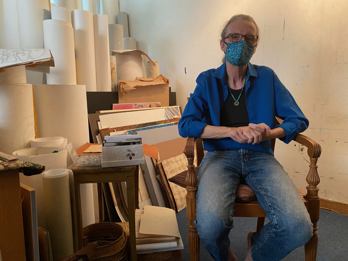
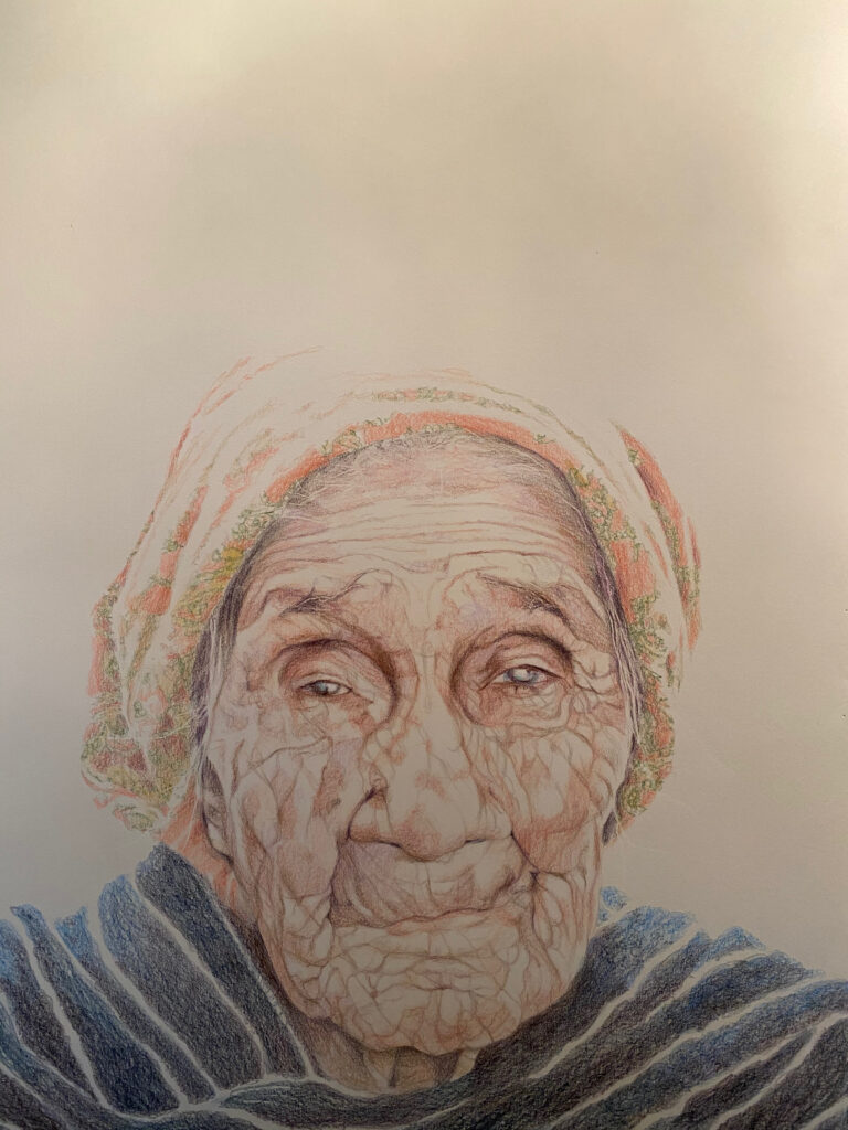
There aren’t too many artists in the City of Los Angeles that offer soothing remedies when visiting their studios. Most of the studios I’ve visited during my time immediately adopt the mind state of the artist – organized chaos. Visiting the creative space of Los Angeles-based artist J. Michael Walker (known affectionately as “J. Michael”) has a different feel, and now I understand why. Born in the American South (Little Rock, Ark), Walker has a soft audible charm allowing you to feel comfortable in his presence. His hair tied back and buttoned-up shirt with rolled-up sleeves is usually how you’ll find him, comfortable but ready to contribute. My second visit to his studio space gave a deeper insight into his practice and I found that comfortability and contribution were at the base of his creativity.
When you arrive at his space you are greeted by African sculptures of the Yoruba Orisha Exú that sit as guardians outside the studio, protecting the energy that lives inside. This immediately gave me the feeling of walking into a sacred space, as these “treasure guardians” were allowing us safe passage into the studio. You’re welcomed by a mountainous display of literature, reference material, and cultural artifacts that absorb three-quarters of the space, leaving the artist a fair amount of space to execute tasks. It always reminds me of my childhood when my mother would ask “How in the world can you find anything in all of this?”, and I’d respond “I know where everything I need is.” I’m certain it’s the same with J. Michael, as he navigates through it all to locate texts and objects to share for our visit.
On display (on the only wall absent his books) was a selection of seventeen midsize drawings, some completed while others sit in progress, offering different representations and poses of the female figure. I was intrigued by the origin of the collection as Walker explained that each began as a figure drawing exercise some twenty-five years ago. As he explains the work, there is a soft piano riff that plays on a small speaker in the studio, very timely background music for this presentation.
As he begins to move the series to another position on the wall to make room for the presentation of another work, he carefully unpins each drawing, treating each piece with special care. The work conveys a level of intimacy, a relationship of trust, and a deep dive into not just the physical, but the innate beauty of each subject and Walker handles them as so.
In one of his projects, a photo series titled “Bodies Mapping Time”, Walker lends that intimacy to the camera, injecting a mature gaze that presents the value of the spirit while using the body as a vehicle. “Bodies Mapping Time” presents dozens of women of all races at different stages of life, as they use photography for “self-empowerment, to overcome abuse and trauma, or to mark milestones in their lives”. The portraits remind me of the nude works of the renaissance with low lighting and high elegance, with Walker using natural everyday furniture, flowers, and objects to accent his subjects. “The reason that these portraits have power is that the women feel totally at ease,” Walker explains, “a comfort that allows them to be themselves and forget the fact that they’re not wearing clothes. My goal is to create an environment that makes the subject feel at ease so that their poses bring out their natural personalities.”
Walker’s figure sketches allowed me to envision Walker’s practice as more of a sculpture study, as he examines the different ways in which a body can be positioned with each pose evoking different emotions. He illustrated the process of sketching a human face that he taught to his class of 4th graders- before classes were halted by the COVID-19 pandemic. He starts by identifying the features that make up the human face and its attributes, simplifying the task, almost leading me to believe I could go home and replicate. Maybe I should sign up for the 4th-grade classes when the pandemic subsides? (Shoulder shrug).
A question came to mind as Walker began to pin a recent portrait titled, “Retrato de Matianita,” to the display wall. “Is it always a subject in mind when artists create portraits or are there times when a person is created from a collection of faces, seen and unseen?” Walker thought back to his days of drawing as a youth seeing images and being able to personalize it, “make it mine”, in his words. The personalization in portraiture is the observer’s experience and interpretation, that still shot that we all have of a person’s face when someone says their name in remembrance.
After pinning the portrait to the wall and fudging with the speaker, Walker sits down to take a breather, but not before reaching over to a box of photos sitting on a stand near more sketch drawings. He shows photos of women from Oaxaca, Mexico on a recent trip. One photo that stands out immediately is of a young woman from the Folklorico dance troupe. She is dressed in a red patterned dress, with a matching headscarf with braided colorful fabric that dangled gracefully from it. The colors of the fabric complimented the bright blue of the rosary that she wore prominently around her neck.
She commands attention by just standing there, looking directly at the camera without striking a pose, surrounded by the natural foliage of the area. The photo is a real-world interpretation of Walker’s portraiture. He feels the power in women and uses his photography, drawing, and painting as a way to honor them. He continued telling stories of the people and his experiences of Mexico as a young man taking in the culture and learning the language, ultimately meeting his beautiful wife, Mimi. He spoke of this moment with great enthusiasm as he talked about his first time experiencing a new culture, turning twenty-two when he arrived. He spoke with a smile about the “drop-dead gorgeous teenage girl” that walked in while he was preparing illustrated texts with the nun he worked with. Prompting thoughts of “I have to stay.” (Laughs).
Walker spoke of embracing the culture, taking in the customs, and trying his best to keep up with the language. He wanted to communicate about the people, about his life, and how appreciative he was for being welcomed into such a loving community, rich with history. He began doing images, immediately finding the value in depicting actual people from the town. He felt it important that he show people in a way that exalted them, a different sentiment than he experienced growing up in the South where he encountered extreme racism toward the Black and Mexican populations. We spoke about how photography from the West (usually by white men), created a derogatory narrative about Latin American countries and the world in general.
He mentioned a photography book that he once came across in Chihuahua, Mexico – his adopted second home –, and how he became offended at how belittling the photos were about the culture. He waxed poetically about creating a project to counter that narrative. Dubbing it the “Invisible Handshake”, Walker looks to “tear down the North American photographer who has gone to Latin American countries and focuses on everything that evokes danger, poverty, and folks without hope”. This immediately made me think of the photographer Robert Mapplethorpe and his work with the male gaze as he looked at the bodies of black men, provoking discussions about race, power, and media – that still haunt our society today. J. Michael is hoping to use his photography to assist that narrative in correcting itself.
After a brief conversation on photography, we turn our attention to the “Retrato de Matianita” that’s displayed on the exhibit wall. These portraits, whether drawn or painted, are considered “Tributes” and are dedicated to the local elderly people in the municipality of Bocoyna, his wife’s homeland. Just like the elderly in our society, the show was hidden inside of the brutalist architecture of Consulate General de Mexico and now in his studio.
Hidden inside of the eyes of the subjects are decades of knowledge, experience, love, pain, and humanity. The focus is solely on the subject, not the artist as he abandons the traditional use of a background in his portraits to direct the viewers’ attention to the entirety of his subject. Walker made the choice not to include anything beyond the faces and a small fraction of clothing only to give a sense of where they’re from. By doing this, he hopes to relate the universality of his subjects. His thoughts are accelerated as he tells a story of a previous visitor comparing the likeness of the portrait to that of his Polish grandmother.
Expressions of gratitude, gratefulness, recovery, and deliverance draw you directly to the eyes of the work. Positioned low on the paper relates the size of the elderly woman with the blank space above as a reminder of where your eyes should be. This creates an intimacy with a stranger, a conversation with not the work but the eyes of a grandmother, the matriarch. He wants the viewer to feel like “they couldn’t escape the encounter with the person, just face to face.”
His use of the whitespace interprets the closeness of the subject to the earth. The use of this negative space works in unison with the pencil lines carved into the thick paper creating uncanny wrinkles, facial hair, and other detailed elements, revealing a level of life as if the likenesses were stamped directly from their person onto the paper. The colors, earth-toned with a graceful blue wrap lending elegance to the subject while simultaneously acting as a stabilizer, as you follow the carefully drawn patterns of the skin not missing a single feature.
Walker works until he feels that his subject is fully present, and then he stops. “If I keep working, then the portrait becomes more about me.” He feels the deepest responsibility to get it right with his wife as his first critic. She also has a personal connection to the work as she was the photographer who provided the referenced images in the series. He speaks with so much love and reverence about his subjects, trying to evoke the beauty and the spiritual essence of the person being memorialized.
He believes it is his gift to create loving, stellar portraits of people who have gone unheralded in life and would possibly never have had their portraits painted had he not done so. The elderly never like to be seen as weak, needing assistance, and/or a burden on society and Walker seizes the opportunity to make the ordinary, royal. He also thinks back to the photography when speaking about the people in the community saying, “I could never use the face of any of these people to say anything that would come across as disrespectful, who the hell am I?”. The portraits also act as a way for the family and community to steal back a moment of the loved ones who are no longer here, revisiting happy feelings, emotions, and memories.
Just as he’d done earlier in the visit, Walker has a seat in his chair and begins to go through another box of random photos, much larger than the one that contained the image of the Oaxacan woman. Before he started to explain what was in the box, I stopped him for a photo in the seat just to capture the moment. The resulting image ironically took on the traits of the Oaxacan woman with the commanding stare (aided by the social distancing mask) as well as the negative space above the head as we saw in the tribute series. A bit of the artist’s repertoire comes full circle, this time with himself as the subject.
As he started to open the archival box, I noticed there are groups of photographs packed neatly with glassine sheets, carefully preserving its contents. Before thoroughly explaining what they were, Walker spoke of his 2000-2008 project titled “All the Saints of the City of the Angels”, an epic painting and text exploration of the multicultural heritage of Los Angeles via its 100+ streets named for saints. He prepared me for some of the images he found during his research, as many contained racist imagery or language that misrepresented the true nature of the people photographed. He spoke painfully about finding an early 20th-century postcard depicting a black woman breastfeeding her child, accompanied by the text “Free Lunch”, and we both gasped at the humiliation placed upon a natural maternal image.
It again brought us to the earlier conversation of misrepresentation through the photography of the West where in many cases, these photographers would make friends with and pay almost nothing to these poor children and/or their families for the impromptu shoot. Not knowing that the image could potentially be manipulated in meaning to a point where it would outrage those who participate. The images were not all negative though; Walker has collected images where the people of color depicted maintain agency, showing joy, success, and pride, showing the uplifting side of the growing city and the people that inhabit it. There was an image of a black woman preserved inside of a photo studio folder, seemingly in her mid-thirties, posing for her portrait of what seems like a graduation picture or maybe a professional career photo. We spoke about what the possibilities could be for these people and assumed where they could be today and how an image may represent a moment in time, it is never the final moment.
As I start to wrap up my time with J. Michael, I watch how he calmly and carefully places all the materials he displayed back into their rightful spaces in the studio not to disturb the energy inside the space. There is a high level of respect that he holds for the objects he collects. He felt he was culturally and spiritually reborn in Mexico and he hopes that experience is transplanted into each artwork he creates. As I walk out of the studio sanctuary, a familiar “Ashe Brother B!’” carries me out. I wave goodbye to the Orishas guarding the doorway and thank J. Michael. That feeling I described earlier heading to the studio was the same feeling Walker described when he arrived in Mexico for the first time. A sense of welcome, a familial hug.
Hank Willis Thomas, An All Colored Cast. Photo By Badir McCleary
An All Colored Cast, Hank Willis Thomas at Kayne Griffin Corcoran
Nestled in a small gated space on La Brea, Kayne Griffin Corcoran presents itself as more of a Hollywood garden party than a contemporary art gallery. You almost have to be “in the know” to know that art openings are taking place here. Known for having its own personal James Turrell installation, the gallery played host to “An All Colored Cast” (I laugh at the irony as I write), a solo exhibition by Hank Willis Thomas. This exhibition was the first for Thomas in Los Angeles.
You are welcomed into the property’s courtyard by the bright orange of A Suspension of Hostilities, 2019, a replica of the “General Lee,” car made famous by the television show “The Dukes of Hazzard”. I immediately wondered how the patrons would react upon first glance with the confederate flag being a centerpiece of the famed auto, (you know, since everyone is so political now and forget it was part of Americana at one point) but felt confident that once I got inside and walked around the show a bit more, I’d find clarity.
I arrived a bit early after visiting other spaces in the area to find the exhibition empty. Guests to the gallery were tuned into the artist walkthrough of a concurrent exhibition by San Diego based artist Raul Guerrero titled “Sonora Desert: Flora, Fauna & Artifacts, on view in the adjacent room. I took the opportunity to spend time with the art from Thomas’ show, trying to gauge how I felt about them before other ideas of interpretation could corrupt my experience. The work presents itself in large abstract forms, taking on the likenesses of earlier creations by esteemed modern artists. I thought of Noah Davis’ 2013 exhibition “Imitation of Wealth”, where he duplicated works of modern contemporary artists in an attempt to disrupt the classism in the access to quality art. I had prior knowledge of the “secret” contained in these works, so I started to do a little digging. Using modern tools (my iPhone) to wipe away the surface and reveal the real jewels hidden in plain sight.
The secret to Thomas’ installation was you had to direct light at the artwork to get the extra effect. The illumination of light would reveal the underlying piece of the artistic puzzle. Taking a flash photo probably worked best I thought, but that’s usually against the rules in art spaces. Since no one was around, and I wanted to see. Like, really see. Fuck it. Let’s do it. I can always apologize (if I get caught, of course).
The first artwork I walked up to was Field Day (Test Pattern), 2019, alarge horizontal panel, divided equally with a spectrum of eight colors that are lined vertically, giving reference to the SMPTE color bars. These bars are a television test pattern for the NTSC video standard in North America. Flash. As I looked down at the phone, the bars magically became transparent and a new image appeared! “Holy shit! What is this?” I thought, “Let me try this again.” You know because iPhones do some weird shit. Flash. It happened again!
What’s shown under the color bars was a still photo of a man in blackface in a suit, smiling and standing around a group of black people. Some also smiling, and others with looks of disappointment. The verticality of the color bars allows each part of the image to be analyzed, bookmarked and separated from the whole for further investigation. Seeing the image as eight separate parts allowed for many main characters, giving each subject a renewed visibility through the detachment.
The crowd then moved into the gallery where “An All Colored Cast” was on view. Thomas began to give his insight on the execution of the work, alongside team members who also contributed their experiences throughout the process. We gathered in the center in the space as Thomas kept instructing everyone to move closer. I’m guessing so that everyone could hear clearly and he wouldn’t have to yell.
An installation titled Not So Easy, 2019, featuring a disassembled Harley Davidson style chopper was spread across the floor alongside a helmet designed with the colors of America and a matching gas cap among the panoply of motorcycle parts. It was like the late stuntman, Evil Knievel had crashed into the gallery and took off before anyone could identify him. I saw the dismantling of the bike almost as a portrayal of the fabric of American values in need of a tune-up.
As Thomas introduced the exhibition, he gave the audience insight into his youth growing up. He waxed eloquently about the images he and his mother (Deborah Willis, a notable artist/photographer, and curator) enjoyed watching on television, which greatly informed his upbringing, and how Black Hollywood shaped the family’s evening entertainment as images like the “General Lee” car was a mainstay in their everyday programming. Thomas further explained that during the research for this show, his team discovered the show’s producers had nearly three hundred replicas of the car – as it was continuously damaged during “The Dukes of Hazzard” filming.
The confederate flag has long been a symbol synonymous with a period of high racial animosity, but in “The Dukes of Hazzard” television show, it’s attached to the car of the hero in the story. I likened Thomas’ story of his childhood entertainment experience to that of James Baldwin, who articulated during a debate with William Buckley, his conflict with the image of Gary Cooper in traditional American Western film. Baldwin expressed cheering on the hero Cooper, only to realize that the Native American “villains”, could be a visual representation of himself in the eyes of his countrymen.
Thomas continued his dialogue with the audience and spoke to the inspiration for the exhibition. He lamented the influence of the modern art masters and how they impacted the series. He mentioned artists like Ellsworth Kelly, Andy Warhol, and Josef Albers whose familiar style of abstract shape can be identified immediately in Thomas’s presentation.
We gathered in front of Deep South (Red Diagonal), 2019, which pays homage to Ellsworth Kelly’s work Red Diagonal, 2007, a beautiful oil on canvas work that features a painted white square overlaid by another canvas painted bright red, conjoining the two panels creating a unified sculptural work. In Thomas’s interpretation, he uses UV print on retroreflective vinyl mounted on Dibond to achieve the result.
After a short explanation of the work, Thomas invited a member of his team to shed further light on the process of developing the series. She also instructed people to move closer (Were we really that far away?) and turn on a light source from their cameras, which would allow patrons to follow along and see first hand the results of the process. Sounds of enjoyment filled the room as the patrons were able to discover what was hidden beneath the surface of the artwork which added a new element and offered an entirely different perspective on its meaning. I was able to focus on the reactions of the guests as I previously experienced their shock and awe moment when I first encountered the “secret” behind the work.
Thomas and associates collectively explained what the image reveals when light is shone onto Deep South (Red Diagonal), 2019. What it shows is a promotional still from the 1975 movie “Mandingo,” in which a white woman presents a very demonstrative face while clutching the rope that is tied to the waist of a slave named “Mede” as he looks on in displeasure. The “Red Diagonal” in this work is used as a point of focus as it highlights the key elements in the image, which are the looks on the faces of the subjects contained within. I was unaware of the film until I began writing this essay. I decided to watch “Mandingo” to understand the context of the image and how it could elevate my perspective. Suddenly, I grasped the many ways that the image in this work profoundly affected how I perceived it.
Various ways of comprehending the visual ran through my brain. In one case, I saw it as the artist speaking to the recent growing interest in art by people of color, specifically significant works by Africans and African-Americans. Specifically, how art is essentially “roped up” or consumed by deep-pocketed art dealers and collectors, looking to stay ahead of the latest flipper. If you’ve paid minimal attention in the last five years, you’d understand that “black art” has become a commodity for collectors and museums alike. These entities present themselves as lost sheep who are looking to make “corrections” while updating e their holdings to include contemporary black artists. I continue to laugh at this thought.
The film “Mandingo” still represented to me the proverbial auction block that black artists have been on lately, gaining roster spots with dealers that traditionally looked past them. Now represented by these galleries, these new “prizefighters” mostly from a cast of people of color take on the task of winning fights (having strong exhibitions and sales), and breeding (being able to bring in other profitable friends) making a worthy investment for these institutions and galleries just as “Mede” was made to do as a slave in the film. Only when investigative articles are written, and tough questions are answered about art dealings, does any of this truth gain clarity.
Could the artist also be insinuating that the inaccessibility to gallery spaces, media, and supportive patrons have suppressed black artists during this period? Hopefully, that’s something the artist will clarify as literature is developed for this exhibition.
The gallery attendant provided the guests with pairs of glasses, with lights attached, allowing viewers to walk the exhibition hands-free. Simultaneously, allowing those without iPhone lights and other devices to participate. Since I had already experienced the reveal of the process on my own time, I wanted to marvel at the real-time responses from the patrons. When the lights were turned off, the viewers became forensic scientists, using the provided tools to enhance their visibility, parsing through each artwork with finer detail.
As Thomas guided us through the exhibition, he reiterated that the images reveal themselves under a direct light source like the Deep South art piece. As each work became the center of concentration, you could see the image come to life with the lights aimed in the same direction. When the work An All Colored Cast, 2019 was illuminated, I realized that Thomas made reference to Andy Warhol’s famed Ethel Scull 36 Times, 1963. This work featured Ethel Scull, the wife of art collector and magnate Robert Scull, with thirty-six different portraits, all with varying color backgrounds. What was really cool about this work was that it included photos of some of Hollywood’s elite stars, again allowing them to “share the stage” through the color division – just like the earlier work.
As we walked toward “People Just Like To Look At Me” (Spectrum IX), 2019 (probably my favorite piece in the exhibition), Thomas enlightened the guests on some of the backstories of the actors and actresses of Black Hollywood. I compare this work to that of Mickalene Thomas’ 2016 exhibition at the Museum of Contemporary Art, Los Angeles titled “Do I Look Like A Lady?”. Her exhibition featured beautifully abstracted forms made from acrylic mirror and wood panel, where leading black women like Diana Ross would be memorialized. I could almost see that exhibition almost as an external precursor to “An All Colored Cast”, gaining inspiration from the viewing perspective of his mother, Deborah Roberts. Especially with Mickalene Thomas’s presentation, curating books, magazines, furniture, and carpets, recreating a black family living room atmosphere.
The sea of light focused on him acted as a spotlight would following a stand-up comedian doing their routine. Or police officers shining their high-beams of white light from their cars into the faces of young black men. Let’s keep it positive and go with the former. Thomas mentioned how many were forced into wearing blackface and portraying “Coon Characters” just to have the opportunity to grace the big screen. And by doing this, it opened up doors for the entertainers we love and enjoy today.
After the walk-through, I got a chance to speak with Thomas about my takeaways from the show. The forensic approach to fully understanding the series encourages the viewer to do a little more to get the intended result. I wondered if he and his team thought of that approach during the conception of the project. To my surprise, he was very interested in my perspective, as his team employed that type of thinking when creating the project, but without using that exact term.
At the end of the day, my question is, What are we shining a light on? If we were to take a deeper look beyond what’s on the surface, will we find the truth? Reality? Will we find change when we shine a light on these replicated situations? Maybe. But if I had to bet, it would be just another rerun. Another “General Lee” replacement vehicle for the hero.
“No other field is closed to those who are not white and male as is the visual arts. After I decided to be an artist, the first thing I had to believe was that I, a black woman, could penetrate the art scene, and that, further, I could do so without sacrificing one iota of my blackness or my femaleness or my humanity” – Elizabeth Catlett
With the rise of attention in works by women, artists of color, and the LGBT community, museums have seemed to pivot in a new direction – prioritizing inclusiveness – in an attempt to “correct” the underrepresentation of such artists in its programming. “Soul of a Nation: Art in the Age of Black Power 1963-1983” featuring the artwork of pioneering black artists, poets, and photographers opened at The Broad Museum in Los Angeles on March 23rd, 2019. This is the exhibition’s third stop in the United States and first on the West Coast – after originating at the Tate Modern in London in 2017. The exhibition celebrates the artists and the movements they helped to institute in the two decades after 1963 when the Civil Rights movement started to gain steam.
Reminiscing through photos from my visit to its installation at the Tate Modern, I attempted to re-familiarize myself with the retrospective by trekking back through the works, re-living some of the feelings I had at first sight. As I browsed through the display, I pondered how the exhibition would be received by the city and its artistic community. How would the museum curators arrange its display inside the institution? The Broad Museum’s plush galleries and modern architectural design have a way of rejuvenating the excitement of the artwork on view. It has the uncanny ability to reintroduce work to its contemporary audiences with newness as if these works were just acquired from the artists’ studios moments before they furnished the walls. I was excited to see if this magic would lend itself to the newest exposition, allowing the artists themselves to relive the moments and actions that spawned these objects. But what in the exhibition would be “adjusted” before it made its Tinseltown debut?
It’s always thought-provoking to see what works are chosen for display and why. Fred Wilson’s Mining the Museum, 1992, at the Maryland Historical Society, brought awareness to institutional collecting and exhibiting practices that often favored the display of works by white men. Through this installation, Wilson was able to unearth works from the collection – alluding to the biases that these spaces have – presenting a case study impossible to ignore. With this in mind, I asked myself if The Broad Museum and its curatorial team would try to lean toward the promotion of more commercial works from the artists – minimizing the history of the period – to focus on drawing more attendance for local and national visitors. Speaking to The Art Newspaper, Founding Director of The Broad Joanne Heyler spoke to the process of deciding on whether to take on this exhibition and how it almost didn’t happen. “There is not an overlap between the artists in the show and the Broad’s collection,” Heyler remarked. With many of the featured artists spending a significant part of their careers in the city and surrounding areas (Betye Saar and Noah Purifoy among the most notable), the biggest question I had for the Broad acquisitions team is – Why not?
Greeting you at the entryway is Carousel Change, 1970 by Sam Gilliam, a large piece of canvas resembling bed sheets with different shades and splatters, which I can imagine lived on the floor of Gilliam’s studio initially. The way this work was displayed at the entrance made me feel a bit uneasy. The last time I saw this work at the Tate, it was presented – in what seemed to be its entirety – full and stretched across the wall accentuating its scale and the vibrancy of color it contained. It welcomed the viewer like a big hug from a grandmother. In this display it confronts me in the form of a mob of seven Ku Klux Klansmen dressed in colorful robes, immediately bringing up thoughts of the 2015 “Birth of a Nation” project by the artist Paul Rucker. I wonder if anyone else felt this way? I digress.
Accompanied by a soundtrack curated by Quincy Jones – which is available via QR code visibly accessible on the gallery walls – you’re audibly guided through the retrospective with a playlist of horn-inspired rhythms and dialogue, allowing you to experience the music that defined the time. Quincy Jones in his summary on creating the list quotes that “You gotta know where you’re coming from to get where you’re going,“ as a precursor to this curation. With hits like “Say it loud, I’m Black and I’m Proud“ by James Brown and “Young, Gifted and Black” by Nina Simone, I was interested in experiencing firsthand how the list would correlate to what visitors experienced. So I pressed play and started to head on in. Ironically, Gil Scott Heron’s “The Revolution Will Not Be Televised” was the opening song.
We are introduced first to the SPIRAL Group, a collection of artists whose work reacted to the Civil Rights Movement, questioning how – as artists – they could interpret the times. Executing works in black and white only, artists like Norman Lewis, Emma Amos, Hale Woodruff, and Romare Bearden among others, sought to challenge the question of the Negro image in visual art. Lasting a few years (1963-1965), the group mounted the only exhibition titled “First Group Showing: Works in Black and White” as a response to black artists being overlooked by the institutions. Similar to a recent epidemic in major cities across the country, rising rents in the area where they gathered cost them their meeting space which ultimately led the group to go their separate ways.
You come across powerful works such as Freedom Now, 1963 by Reginald Gammon referencing The March on Washington. Depicting a scene of activists in bunches – seemingly about to march right out of the painting into the gallery – it struck me how using only the two primary colors the artist was able to conceal the races of the subjects. This manipulated viewpoint gives evidence to the “We are all in this together” motto that is often brought up during points of civil unrest in America.
The most astounding and polarizing work to me in the SPIRAL gallery was America the Beautiful, 1960 by Norman Lewis. This abstract work at first glance appears as random swipes of white house paint on a black panel, insinuating at a figure to be revealed once the viewer steps back to catch a full view. Upon further investigation, you see the shapes in the paint start to materialize and then realize you’re looking at a representation of a Ku-Klux-Klan meeting. I love the correlation in these works together. These works represent groups of people acting out its form of support for their message, which mirrored the inception of the SPIRAL group. It also puts on full display the duality of the American reality where dueling classes continue to battle for their rightful place in society. I often see the SPIRAL Group reemerging in the work of contemporary artists like using the same color palette to deliver his vision.
As the decade progressed and the voice of “Black Power” started to define itself through defiant imagery, black artists aimed at creating an identity of activism through their work. Symbols like the raised fist – The Black Power salute – and the American Flag were used as catalysts, sparking debate about the country’s treatment of its African-American citizens. This led to the emergence of the Black Arts Movement (BAM) which like the SPIRAL Group, organized their communication through artistic practices – albeit more politically charged. The gallery presents some of the imagery in the form of newsletters, caricatures, posters, and magazines in a vitrine showcasing the outreach of the groups in different forms of media.
Immediately upon entering the gallery, you can feel the tension in the work. Hinting at the catalysts previously mentioned, works like Kay Brown’s The Devil and His Game, 1970, depicting then-President Richard Nixon playing what appears to be a game of checkers with Rev Dr. Martin Luther King Jr, using black children as the game pieces. And Dana C. Chandler’s Fred Hampton’s Door #2, 1975, a sculptural replica of the front door of Black Panther Fred Hampton that was shot through by Chicago Police – eventually entering and murdering him and another Panther member. They combined a grim history within its presentation. Mixed in with these works is Blackboard, 1967-71 by Cliff Joseph, showing a female teacher and young male student locking eyes with the viewer in front of a blackboard containing a Black History alphabet. Joseph used the subjects as signals for the need for “new revolutionary vocabulary”. The artworks in this gallery are more direct in their presentation – with the artists not pulling any punches – using the material as a channel of expression.
Benny Andrews’ Did the Bear Sit Under The Tree?, 1969, stares at you with the shaking fists of a man who has had enough with the country whose liberties he thought he’d be able to thrive under. The rolled-up nature of the flag in this work was very telling as it could describe what you would find if you look behind the curtain of America, or possibly, a fed-up citizen rolling up his flag to discard it – because its meaning doesn’t apply to him anymore. Andrews along with Cliff Joseph created the Black Emergency Cultural Coalition (BECC) in response to “Harlem on My Mind”, a 1969 exhibition at the Metropolitan Museum of Art in New York, in which all the black artists in the neighborhood’s invitations to participate mysteriously got lost in the mail. I hope you can appreciate my sarcasm.
I loved the juxtaposition of the works by Faith Ringgold (The Flag is Bleeding, 1967) and Elizabeth Catlett (Black Unity, 1968). Ringgold’s work arranges three figures behind a blood-soaked flag. All are locked in arms with the figure of a black male obscured behind the stars. What makes this stand out, even more, is that the black male in the painting holds his hand on his chest – reminiscent of the pledge of allegiance – but is also clutching a knife. I would love to know what that’s all about. Catlett’s Black Unity, 1968, is a double-sided sculpture appearing as either a clutched black fist or a duo of faces depending on where the viewer is positioned. Made from mahogany, the bronze nature of the wood accentuates the message of “Black Power” – as it is polished to read as black skin. When I doubled back and looked again, it’s almost like the black male figure in Ringgold’s work is having a dialogue with the faces of Catlett’s sculpture. It’s as if they’re sharing an intimate secret, instructing folks to stand firm but always watch your back.
I was a little disappointed to see that American People Series #20: Die, 1967 by Ringgold was replaced in The Broad Museum curation, as I really enjoyed seeing it in the Tate Modern display. Why the change? Was the loan period was over from the MoMA? Who knows?
In the black community, “The Streets“ has been a term used to represent being excluded from the mainstream, forming an underground set of values. Many black artists sought visibility outside of the white cube by taking to muralism. As an addition to the display, the curators presented “Art on the Streets”, a slideshow of archived photography of these murals across America. Focusing on The Wall of Respect – a mural on Chicago’s South Side – the murals became a place for gathering, ultimately leading to a rise in muralism across black neighborhoods. Being a Los Angeles resident, places like Leimert Park and The Great Wall of Crenshaw come to mind as references to how the wave of black muralism inspired the optical tone of our neighborhoods.
Chicago was a key location in the Black Power movement and in some cases has been dubbed “The Heart of Black America”. Producing art movements like AfriCOBRA (African Commune of Bad Relevant Artists), artists in the Midwest looked to add a new flavor and rhythm to contemporary painting. The group set out to paint positive vibrant images of black figures and penetrate the scene with an abundance of color. The works speak action into the gallery easily dominated by Wadsworth Jarrell’s depictions of Angela Davis in Revolutionary (Angela Davis), 1971 and Malcolm X in Black Prince, 1971. Both paintings burst with the images of the activists, surrounded by text that form to their features on canvas. Jarrell chose to use one of Malcolm X’s speeches at the bottom of the painting, giving power and emphasis to his words, while Davis’ image – pulled from a LIFE magazine photograph – was adequately decked out with a shoulder strap filled with wooden dowels (“bullets”), reflective of one of Jae Jarrell’s Revolutionary Suits – that was on display in the center of the room.
It was cool to also find the same admiration for Jarrell’s Revolutionary Suits in Jeff Donaldson’s Wives of Sango, 1971, which portrays three black women heavy militarized in formation, ready to take on anything that’s in their way. Donaldson presents the women as different ages, in different styles of clothing, and with different hairstyles – showing the varying appearances of the black woman – while concurrently alluding to their willingness to protect at all costs. If you’ve ever come across a black mother then you know this to be all too true. Carolyn Lawrence bursts with her colorful jazzy canvas work titled Black Children Keep Your Spirits Free, 1972, which resembles a poster from the psychedelic era, vibrant with color, and a slurred movement almost as if time is slowing down as your viewing.
As we enter “Black Light”- a gallery highlighting the work of black photographers – we come across an array of black and white works led by Roy DeCarva, showing his range in creating deep tonal photographs of life in New York City. Before seeing his work in the exhibition, I was under the impression that Gordon Parks – who is noticeably absent from the display – was the pioneer for the photographs of black life in America. I believe that while Gordon thrived in storytelling through documentary photography, Decarva set out to show blackness abstractly – focusing on the skin tone and features of the subject – creating drama through moments of calm. One of those moments came in the form of Shade Cord and Window, 1961, where a thin piece of string takes the form of a noose. Positioned close enough to where the window sill creates a bold shade of black, the string gently, quietly, and ferociously stands firm in the photo overlaying a building in the distance. This photo to me is quite moving. I believe Decarva spoke to the systematic racism in the inner city and how that ugly part of history seems to be inescapable.
Alongside the photography of Decarva, I was also introduced to the work of Beuford Smith whose 1968 photograph Man with Roses, 125 St. NYC, 1968, was another that stopped me in my tracks. Promoting black love, Smith seems to catch an older gentleman at random – possibly at a bus or train station as you noticed a woman walking with a bag in the background – waiting patiently with flowers for a loved one.
Also in the room was a vitrine featuring publications and photo books, under a curated selection of photographs by artists who worked concurrently, such as Herb Randall, Herb Robinson, Adger Cowans, Al Fennar, and Ming Smith. A nice bonus was seeing a digital copy of In Our Terribleness, 1970 by Amiri Baraka (formerly LeRoi Jones) and photographer Fundi (formerly Billy Abernathy). Fundi created the “Portraits of Life” in which Baraka responded with poetry. In his poem, Baraka explains his use of the word “Terribleness” as a way to uplift, a “new self-confident beauty”, enforcing the expression that “Black is Beautiful”. I would’ve loved to see the works of Howard Bingham in this section as well. His iconic black and white photographs of Muhammad Ali – a key Civil Rights figure – would have been in total sync with the tone of the exhibition as sports played a huge role in pushing the “Black Power” movement forward.
If there is one benefit to living in Los Angeles it’s that you get first-hand experience in Assemblage Art. From Noah Purifoy’s Outdoor Desert Art Museum to the sculpture of Betye Saar, the artists of the city have been the trailblazers of the movement, often incorporating elements of their reality to stage new experiences. Nails, steel, saxophones, and an old banjo case are just a few of the random items that you’ll encounter as you explore the oeuvre of the featured artists in the gallery. You’re welcomed immediately by Saar’s work Sambo’s Banjo, 1971-2 (On loan from California African American Museum (CAAM)) in which she uses the inside of a banjo case to stage a violent double lynching. In a plot twist, just above the victim, Saar – according to the documentation – left the tiny rifle visible for the character to free himself, ultimately placing his survival in his hands. This already sounds like a damn SAW movie. (Laughs.)
The room also features About Martin, 1975 by John Outterbridge who personally became a favorite of mine after seeing work of his at an exhibition at CAAM a while back. I again fell in love with this work as Outterbridge presents a tribute to Rev Dr. Martin Luther King Jr. in the form of a miniature closet resembling a military shadow box. A suit hangs in the space just under a picture of his widow Coretta Scott King, reminiscent of the wardrobe he wore in public. The suit sits on top of a black box with the names of the cities (Montgomery, Birmingham, Selma, Washington) where some of his most famous speeches were held.
One new work by Noah Purifoy was added to the Los Angeles display, too much excitement of the local visitors. Watts Riot, 1966, contains debris from the 1965 Watts Rebellion to which Purifoy transformed into the work. The piece looks as if you’ll be able to still smell the charred material but good luck getting anywhere close enough to verify it. When I look at Watts Riot, 1966, I can see the influence of Purifoy on today’s contemporary artists like Mark Bradford – also from South Los Angeles – who employ the same anthropological process to art-making. With the museum featuring a few works by Bradford in its main galleries upstairs, it allows the show to draw connections and create a bridge for viewers to understand the artistic lineage. Sidenote: Mark Bradford’s Deep Blue, 2018 is a must-see.
Not to be outdone are the “Game of Thrones” style metal works by Melvin Edwards (Some Bright Morning, 1963, Afro-Phoenix #2, 1963 and Mamba, 1965) from his Lynch Fragment series. Commenting on social injustice, Edwards used the rough material of welded steel to present abstract visual commentary and possibly gaining acceptance into the Night’s Watch along the way. John T. Riddle’s Bird and Diz, Spirit versus Technology series, 1972 resemble Outterbridge’s work as collected materials are housed together to form a larger message. An homage to Charlie “Bird” Parker and Dizzy Gillespie, the work contains a saxophone and trumpet – which protrude beyond its casing – in what Riddle calls a “breaking out of the boxes,” referring to the musicians’ ability to transcend with their musical innovations. I would love to see how this work talks to Jean Michel Basquiat’s Horn Players, 1983 in the same space as it also speaks to the improvisational style of artistry that the musicians shared. Definitely worth a trip upstairs to compare.
“Three Graphic Artists” dedicated to the 1971 exhibit of the same name at Los Angeles County Museum of Art (LACMA) featured Charles White, – whose solo retrospective is currently on view at the institution until June 2019 – David Hammons, and Timothy Washington – who I’ve had the honor to meet through artist friends in the city. Under the mentorship provided by White, Hammons, and Washington were able to develop techniques that would help define their work for years to come. Hammons experimented with vegetable fat while Washington developed a new form of etching onto metal, visible in his work One Nation Under God, 1970.
The highlight of the show for me was David Hammons’ The Door (Admissions Office), 1969. In this work, Hammons’ famed body print technique – also on display in the remaining works by Hammons in the gallery (Black First, America Second 1970, Three Spades 1971, and Spade (Power of The Spade), 1969) – is displayed on an old wooden door reminiscent of the interior doors in a schoolhouse. On the glass that sits in the door under the words “Admissions Office” in vinyl, you see an oil-based imprint of hands, a face and part of a body giving off the strange appearance of “Hands Up, Don’t Shoot!”, a catchphrase derived from the 2014 murder of Eric Garner.
It was easy to see the references to the young black bodies sacrificed to the inequality of the American school system. It’s always icing on the proverbial cake when you continuously encounter work whose meaning is still just as clear today as it was during its inception. The display of this work brought up thoughts of nostalgia, as I was quickly reminded of the museums opening day in 2015 where the press was welcomed by picketing teachers making their voices heard about Eli Broad’s (Philanthropist and Founder of The Broad Museum) involvement in a plan to increase private education through charter schools. I wonder if any of the curators considered this? Or if they even remember that? Hmm. Carry On.
As you’re preparing to cross into the next gallery, you are forced to face Hammons’ powerful work Injustice Case, 1971. Again employing his body print technique, Hammons sought to bring awareness to the treatment of Black Panther Party co-founder Bobby Seale during his trial – where he was bound and gagged after outbursts in the courtroom. A very harrowing image wrapped in the American flag, Hammons sought to “frame” the results of an oppressive structure, with the work appearing as an X-ray into the fabric of the American justice system.
I hate to write this, but the East Coast Abstraction gallery was my least favorite of the exhibition. I know, I know, it has powerhouses like Jack Whitten, Ed Clark, and William T. Williams but these works – while powerful on their own – just did not feel right together in this layout. These works are larger but lack the intensity of some of their smaller counterparts in the previous galleries – at least collectively. Speaking to the abstract nature of representation, these artists took to hard-edges and color staining as methods of creation, challenging the fact that blackness had to be rooted in figurative painting.
The gallery introduces its story with Jack Whitten’s Homage to Malcolm, 1970, an abstract tribute to the late Civil Rights leader Malcolm X. Executed on triangular canvas, the shape represents the pyramids of Egypt of which Malcolm visited on his pilgrimage to Mecca. With actions rooted in the Black Power Movement, Whitten took to his Afro-comb to move around the black paint in the center of the work – releasing hues of green, red and blue – and providing a ridged texture in the center.
Close by, you find Sam Gilliam’s April 4, 1969, a large stained canvas tribute to Civil Rights leader Martin Luther King Jr. marking the day of his assassination. This was one piece that presented itself to me as more of a representation of the evidence than a tribute. The dark reds and staining remind me more of the effort to save Dr. King’s life after he’d been shot. I see more of the blood-stained fabric of the first responders and friends who fought tirelessly to save his life. Maybe this is a tribute to them? Or maybe a reminder of what we lost as a community?
Trane, 1969, by William T. Williams provides the burst of color you’ve come to expect from abstraction with vibrant jagged lines that capture a multitude of colors finding their way through. Acting on the improvisation of Jazz – which he referred to as “Abstract Music” – Williams uses the hard-edged lines like a music visualizer, attempting to replicate the powerful sound from the performances of John Coltrane.
Peeking into abstract minimalism are the works by Virginia Jaramillo (Untitled, 1971), Daniel LaRue Johnson (D9 Flat 5th, 1969), and Tom Lloyd (Narokan, 1965) who was among the first to experiment with manipulating light as a form of art. It was really hard to experience the potential light show of Narokan, 1965 which was installed way too high to truly enjoy. This could’ve been done just a tad bit better in my opinion.
Before you crossover to the next gallery, you meet the egg-shaped canvas of Ed Clark with Yenom (#9), 1970. The work has a planetary feel reminiscent of gas giant Jupiter, with its landscape blurred – revealing only tidbits of the surface. It was interesting to read that this work (along with Virginia Jaramillo) was included in the racially integrated 1971 exhibition “The DeLuxe Show” in Houston, Texas. The show proved to be monumental as the artists descended on the Fifth Ward and provided the neighborhood with access to fine art and a foundation in which to look at black artists and modernism.
Cruising into the next gallery, you’re welcomed by the smooth and cool Barkley Hendricks who – with four large works – takes the lead in the space. The first of the Hendricks works you come across is Icon for My Man Superman (Superman Never Saved Any Black People – Bobby Seale), 1969. A portrait of the artist standing confidently against a heroic silver background, almost presenting himself as a packaged children’s toy with the “I’m all the hero you need!” moniker. With his arms crossed, he is seen sporting an afro and dark sunglasses – a tribute to the Black Panther Party leader Bobby Seale – and a Superman T-Shirt covering only up to the top of his pelvic area. Unlike his work Brilliantly Endowed (Self-Portrait), 1977, which sits across the gallery, Hendricks does a better job in this portrait of at least concealing his genitalia. (Laughs). The artist is posing naked with a white leather hat and sunglasses, wristbands, jewelry, socks, and sneakers with a very matter-of-fact demeanor. Hendricks’ exploration of his nude body stemmed from a review by the New York Times art critic Hilton Kramer – in which he referred to the artist as a “Brilliantly Endowed Painter”. Hendricks used his work (with that quote as fuel) to explore the black body as a subject while demonstrating his skill as a painter. I’ve often seen this work as a rebuttal to that of Robert Mapplethorpe and others, who were often criticized for their fascination with the black male body and the exploitation thereof.
Alice Neel presents a content Faith Ringgold seated in a bright red dress with floral print, led by dark blue strands of color that goes extremely well against the striped chair that she’s seated on. She has one hand clasping the other, as she stares directly at the viewer with a look of patience and security. Neel gives Ringgold what looks like two rosaries around her neck – possibly hinting at Ringgold’s commitment to her faith. Faith Ringgold, 1977, I believe focuses on the artist’s strength and commitment to her causes as an artist and woman, and Neel’s respect for her ambitious spirit, with the composition and position evocative of a presidential portrait.
Raymond Saunders’ portrait features the first African-American World Heavyweight Champion Jack Johnson (Jack Johnson, 1971) as an armless dark green figure in a blazer, tie, and slacks mixed in a splash of color. Inside of the vibrancy, the artist scratches the signature of the champion vertically on the right of the subject, along with a date inscribed on the bottom left, maybe hinting at the reference photo that could have been the source for the work. I think of the color splash as the noise around him as he climbed the ranks in boxing to become the champion. With his mouth being the only visible feature, Saunders places a grin on Johnson as if to imply the artist “smiling through it all” as he moves forward through his success.
Emma Amos’ portrait pays tribute to an icon in her life with Eva the Babysitter, 1973. A yellow background sets the tone for the dedication, as she presents Eva seated comfortably in a red chair – smiling as she poses for the portrait. A child enters halfway into the frame – possibly Amos’ daughter unable to sit still during the process – insisting she is included. This addition of the daughter shows the loving relationship of Eva to the mother and child. I love how Amos adds the parquet floor with the red, white, and black carpet to break up the strong yellow in the painting, allowing for the reddish hues in the clothing of Eva and the seats to have more of a presence in the work.
I can remember the first time I saw Beauford Delaney’s Portrait of James Baldwin?, 1971. After reading the description I remember saying to myself, “How is there a question about the portrait if they were known friends?”. I’ll admit that there is something a bit off about the work, but it has all of Baldwin’s characteristics – the receding hairline and turtle neck were dead giveaways – and at the time the artist was going through a few mental health issues that could’ve made his memory of his friend’s facial features a bit skewed. The mustard color palette is a sharp contrast to the more colorful portraits by the artist of Baldwin. Like his 1945 painting (Portrait of James Baldwin, 1945) in which bright reds, bold blues and interchanging shadows of brown, yellow, and white accentuate the detail in the skin, giving a more impressionistic look. Although titled by Baldwin’s brother, Baldwin himself owned this painting and I’d like to think he wouldn’t keep a random look-alike painting (laughs).
The final two Barkley Hendricks works speak to his brilliance in using solid backgrounds of a specific color, while his subjects are overlaid with fabrics that mirror the tone of the backdrop. What’s Going On, 1974, always reminded me of a Motown singing group. Four of the five subjects in the painting are dressed in all white with hats to match, and the fifth one is a woman who is shown naked with her black skin as the beautiful contrast against the bold white background. Blood (Donald Formey), 1975, is a deep blood red painting of a man dressed in plaid, toting a tambourine staring firmly at the viewer. I’ve always wondered if the primary colors of these works were representative of something. Maybe the mood or vibe the artist got from the subject? Maybe it was the dominant colors in the clothing when he started his study sketches? Perhaps that’s research for another essay.
Improvisation and experimentation have always been key to the development of new forms of art-making and storytelling. Using materials from the unified experience of the black community, the artists in this section sought to expound on their practices by introducing new ways of presentation, allowing viewers to mentally participate in understanding the message. Alongside these materials are the stories that come with their use. Melvin Edwards’ powerful work Curtain (For William and Peter), 1969 – named after artists William T. Williams and Peter Bradley who were once his studio mates – is as haunting as it is provocative.
The work, very minimalist, employs barbed wire and chains to hint at the history of American slavery and incarceration. The barbed wire strands hang down from an overhead base connected by chain links. While at the bottom, each piece of wire is intertwined with the chains – calling attention to a prison chain gang or the terrible history of slavery in which groups of slaves were chained in unison to be sold. With prison reform a hot topic in current culture, this work almost feels contemporary as these same elements and materials are taking a larger role in our society with the privatization of the prison system.
Alvin Loving’s, Untitled #32, ca. 1975, and Joe Overstreet’s We Came from There to Get Here, 1970, are prime examples of how artists experimented with the installation and display of their work. Loving cut up his painted canvases only to sew them back up again into new realities, creating colorful collaged textiles. The works are very reminiscent of quilts that have been passed down through generations in the African-American community, with new additions as time goes on. Overstreet used the rope as a way of demonstrating the horror of lynching, but also the possibility of freedom with the rope also used a supports for the work. With its tent-like appearance, the work presents itself full of energetic color with a clever undertone hinting at black artists “setting up camp” in the art world – accentuating the speculation of a “black art” aesthetic.
Alma Thomas’ Mars Dust, 1972 – one of the paintings displayed in her 1972 Whitney Museum of Art Show – shows the artist’s fascination with space. With bright red brushstrokes overtop shades of blue (that try and peak through space in between), Thomas reimagines dust storms and landscapes as she sought to stimulate her fascination with space travel. A pioneer in abstract painting and a member of the famed Washington Color School, Thomas focused on movement, patterns, and consistency in abstract painting. Her work Watusi (Hard Edge), 1963, was selected by First Lady Michelle Obama for display in the White House. For an artist who was said to be overlooked, she was constantly on view in the West Wing during the Obama presidency.
The largest work in the gallery – Frank Bowling’s Texas Louise, 1971 – gives the viewer a feeling of approaching the peak of a mountain range to look at the sunset. Vibrant ranges of color blend with stenciled outlines of the continents, referring to the global mindset of identity. As you spend time with the work you can’t help but think of Bowling’s concept of the Map Paintings and how they relate to our current world. These works according to Bowling were to “celebrate a more fluid and open idea of identity and belonging to the world”, a contemporary concept talked about but rarely practiced.
Last but not least in the gallery is Jack Whitten’s Asa’s Palace, 1973, a large purplish canvas with islands of green paint that give the impression of vines in a wisteria tree. Using what Whitten called a “developer”, he created “rake-like” strokes, with the results imitating pulling the canvas fresh from a printer jam.
Entering the gallery dedicated to the work of Los Angeles-based artist Betye Saar is like stumbling into a secret antique store in rural Louisiana. The works are very ritualistic, with sculptures resembling altars and artifacts of ceremony that Saar uses almost as remedies, mentally inoculating the viewer through the context of each assembled object. Welcoming you into the gallery are Mti, 1973, and Spirit Catcher, 1977, two totem sculpted works with a myriad of materials. These two works are seminal as Mti, 1973, was featured in her first survey show “BETYE SAAR 1964-1973” at the Fine Arts Gallery at The California State University in Los Angeles and Spirit Catcher, 1977, is the result of a research trip to Haiti – in which she studied religious belief systems and practices. I have always been amazed at the practice of Betye Saar as it speaks not only her artistic imagination but the depth in her research as there is something new to find in every repeated encounter.
Above your head are Rainbow Mojo, 1972, and Eye, 1972, work made from cut and stitched leather topped with acrylic paint to mirror their respective subjects, hanging by clear string banner-like from the gallery ceiling. Nine Mojo Secrets, 1971 and Ten Mojo Secrets, 1972, face each other in the gallery, and to understand them both, I had to do my own research and it was very informative. I found out that a “mojo” is a charm that is lauded for its purported magic and ability to heal. It was also revealed that Saar’s zodiac sign is Leo, which explains the toy lion – a symbolic reflection of herself – in the work. The lion makes another appearance in Eshu (The Trickster), 1971, this time as a portrait made out of wood, leather, straw, and feathers. I like to think this work is the artist recognizing the strength associated with her zodiac sign. Bold and full of pride and power, the lion takes the form of an African mask or a stele made from contemporary materials.
As you head up toward the finish line of the exhibition, you start to see light at the end of the proverbial tunnel. The exhibit starts to say its farewell as you can hear the crowd gathered in the lobby, awaiting their pilgrimage through the sea of visual black history. The final gallery is dedicated to the work and legacy of Just Above Midtown, – better known as “JAM”- a gallery program created by Linda Goode Bryant, focusing on exhibiting the work of African American artists. Situated in the heart of New York’s commercial art world, Bryant created a marketplace for the work of artists of color to be “seen and work to be sold”, becoming a center of black art exhibition, and a space for avant-garde ambition.
In the vitrine placed at the center of the gallery were Items from the JAM archive, including installation photographs, exhibition posters, catalogs, and publications as well as performance documentation that captured the essence of the gallery’s programming throughout its duration. It is amazing to see the amount of pride and also growth that the space produced during its history, lasting from 1974–1986.
The artists featured in the gallery were instrumental to the rise and success of JAM. By creating work that allowed for discussion, immediately provided insight into an artist’s vision. Artists such as David Hammons and Senga Nengudi used activation as a form of interaction, creating works that were lauded and also heavily debated. JAM was able to use interaction as its calling card, staging large-scale projects inclusive of the community like Lorraine O’Grady Art Is…, 1983 at the 1983 Harlem African American Day Parade.
Her forty-part photography series featured selected portraits of Harlem residents along with local storefronts and building facades that represented the fabric of the community. As the story goes, Grady entered a float in the parade which displayed a large gold picture frame. She also hired fifteen dancers to survey and interact with the parade crowds with smaller gold frames, extending the experience. In essence, to be inclusive, Grady used the public performance as an opportunity to finally “include” black people in contemporary art as many of the onlookers and participants jumped at the chance to take part.
Senga Nengudi creates works based on performance using nylon tights among other objects such as sand and rubber. I laugh when I think of my first encounter with her work in London. I initially felt cheated as if someone was playing a trick on me. For me, that was the final straw in this new contemporary art scene. “Tights with sand? How fucking desperate are we?” I thought, not knowing how uneducated I was to the power the artist had in her performance. It wasn’t until I came across the Tate Modern’s video series “TateShots” and viewed an interview with Linda Goode Bryant and Senga Nengudi did I truly comprehend the level of artistic genius she exhibited.
Her work Internal II, 1977, 2015, reminds me of a spider’s web providing support to the walls of the gallery. As I learned more about the work, I understood that it spoke to the strength of the female body and it then it made sense. Senga mentions in the “TateShots” video how the nylon is at “wit’s end” from being stretched to the point of anxiety. I immediately felt a connection to the work and how it represented my mother, a strong single woman who stretched everything she had as far as she could to see me and my brother succeed. Even if it meant she would herself be stressed and challenged beyond her greatest capabilities. As Nengudi relates it to black females, she comments on the female body being reflected abstractly as being “used” and I contemplated the way we view women and beauty standards in society. I started to think of the women who struggle to return to their normalcy after childbirth and how tough that can be. I believe this was a great way to deliver the message as you could see the strength in the fragility, a perfect reference to the female body.
David Hammons’ Bag Lady in Flight, 1975, reconstructed in 1990, leads off the display of his works shown in previous exhibits at JAM. I swear when I look at this work I hear Erykah Badu’s song, “Bag Lady”. Made from shopping bags, grease, and human hair, Hammons looks to these materials and the results of the incorporation as a dedication to the positivity they hold in the black community. I see this work as a tribute to the spending power of the black woman. With the hair and grease being primary materials in the work, I think of companies like Bronner Brothers and how they have built a billion-dollar industry with hair care products all through the spending of black women. Funny enough being from Philadelphia, a brown greasy bag has always made me smile because inside of that bag usually awaited a cheesesteak which could explain my immense hunger after the exhibition. (laughs)
Also included was Untitled, c.1980’s, a wall sculpture made from pork ribs, tire inner tubes, and costume jewelry that I still can’t grasp the meaning of. I’d like to think it represented part of his upbringing and the materials and objects that were part of his everyday life. Just as in Bag Lady In Flight, 1975, Hammons uses the items to spark a form of nostalgia, tying seemingly different items together. Maybe this was a dedication to summer cookouts and neighborhood bike riding?
One of the absolute coolest works in the exhibition is Dawoud Bey’s A Boy in front of the Loews 125th Street Movie Theater, 1976, printed by 1979, showing an adolescent boy decked out in the latest fashionable tracksuit, a stylin’ pair of shades, holding what appears to be a juice carton posing on a wooden barricade in front of the theatre. The most notable thing in the photos to me was the kid’s bright white sneakers, as the beautiful contrast in the photo makes them seem to glow. This effect is also replicated in A Woman at 7th Avenue & 138th Street 1976/7, printed by 1979, where the subject’s shoes and purse reveal a similar radiance.
Howardena Pindell’s Untitled, 1978, and Randy Williams’s, Color in Art, 1976, round out the gallery displaying new abstract assemblage practices within. In Pindell’s Untitled, 1978, she uses hole-punched dots to create a texture similar to braille on top of a re-sewn canvas. The work merges the senses as each looks deeper it seems as if you can feel the texture across your fingertips. Prompting you to reach out only to be reminded to “please stay a foot behind the line” by the gallery attendant. In Color in Art, 1976, Williams uses wooden window shutters as the structure for the work accompanied by rope and a book screwed down to the wooden frame with a plexiglass plate. Williams’ work deals with the parallel themes of inclusion/exclusion, a topic he feels still needs some addressing as he continues to develop his practice while working as a college professor.
As I exited the final gallery, I ran into Self, 1978, by Martin Puryear (Puryear will represent the U.S. in the 2019 Venice Biennale) which I must’ve completely missed walking up to the exhibit entrance. In the Tate Modern curation of the show, the work was featured in the Improvisation and Experimentation gallery but somehow made its way outside the exhibition in LA. Possibly to highlight his Biennale accomplishments which I certainly am not mad at. The work is made of cedar and mahogany stained black, sticking upwards off the plinth resembling the fin of a shark on the hunt. The work as the artist explains is a representation of self as a secret entity that appears heavy and strong but in all actuality is quite hollow. If that ain’t a jab at humanity I dunno what is. But Puryear is careful in his interpretations often leaving it up to the viewer. He stated, “I value the referential quality of art, the fact that a work can allude to things or states of being without in any way representing them.”, creating his form of symbolism as a vehicle for characterization.
So what’s is the next step after Soul of a Nation? Is this the beginning of the retrospective for black art movements? Soul of a Nation: Art in the Age of Black Power 1963-1983 was a great insight into the artistic movements that existed during the Black Power era and serves as a visual history. Are era-based retrospectives the best way to understand the African-American contribution to the global art world? As I write this essay I think of what I’ve learned just by observation. The research of artworks allowed me to understand the artists’ backgrounds, their materials, and how their use of them helped to change and develop the practice of art-making. It uncovered artistic movements that mirror those of contemporary art today, adding credence to the “history always repeats itself” saying. It also was a strong reminder as we look in that same mirror, that many of the reasons for collectives like the Spiral Group and Just Above Midtown still exist today, with black artists and professionals combating issues of inclusion in museums and blue-chip galleries in new ways.
This retrospective has activated the city with showings of black artists, as local galleries and museums are presenting complementary shows adding appreciation to the contributions of black artists to the fine art canon. I wonder how or if this exhibition will improve the primary and secondary markets of the participating artists? Will artists like Betye Saar, Jae Jarrell, and Alma Thomas start to enjoy the same market success as Njideka Akunyili Crosby now that this show has made its mark? How long will these works remain with their current collectors? It will be very interesting to see what the future holds for the careers of these artists, but for now, we can all enjoy and bask at the moment for however long it lasts.
Soul of A Nation: Art in the Age of Black Power 1963-1983 is on view at The Broad Museum, 221 S. Grand Avenue, Los Angeles, CA 90012. Through Sep. 1st, 2019, https://www.thebroad.org.
Located at the Paramount Studios lot in Hollywood, the first edition of the Frieze Art Fair encompassed a full-on art gallery fair experience alongside the exterior New York backlot, which featured projects of selected artists from galleries participating in the fair programming. I was really excited to cover the inaugural Los Angeles edition of the fair as I have been to and covered the London and New York editions, and they have been simply amazing.
A favorite of mine is the programming for the Frieze Masters section, featured in the London edition. It gives the feeling of perusing through the collections of a global public museum. I was intrigued at how the fair’s curators would incorporate the backlot into its programming, as they’ve done with projects like Frieze Sculpture (another favorite).
Photo by Badir McCleary
Kicking it with Jerry Saltz. Photo by Badir McCleary
Kicking it with Jerry Saltz. Photo by Badir McCleary
As I arrived at the wrong gate (there were like five of them) for entry into the Paramount lot, I crossed paths with Jerry Saltz and got to have a short conversation with him and a cool selfie. To my surprise, he knew who I was – well, my work. I finally walked a couple of blocks to the correct entry and headed to see what all the fuss was about. I decided that it would be smart to head to the Frieze Projects section first, as the inconsistency with the weather would dampen the outside experience.
As you walk from the entrance to the backlot you couldn’t help but notice green stickers with bold white writing placed randomly along the walkway, grabbing the attention of visitors. These stickers posed questions to the viewer like “Whose Values?”, and “Whose Beliefs?”, allowing viewers to ponder what the answer would be as it related to them. This was a public art project by artist Barbara Kruger titled Untitled (Questions 3), 2019, with her famous style of boldly questioning authority through her visual practice.
Photo by Badir McCleary
Photo by Badir McCleary
Photo by Badir McCleary
If you weren’t looking down at Kruger’s public project you were probably looking upward as visitors were greeted by a large, almost movie poster-ish banner artwork presented by Los Angeles-based Contemporary Artist Mark Bradford. The banner featured a body camera on a white background titled Life Size, 2018 (which I later found out that he sold as a limited edition print through Hauser and Wirth for the Art For Justice Fund).
The Paramount Studios New York City backlot presented a different experience for visitors as it had the feeling of walking around the local neighborhood and finding a block party. It also felt very Disney, as building doors that opened up to nothing and streets that went nowhere quickly reminded you that you were “on set”. Such an appropriate feeling for an art fair, wouldn’t you say?
Photo by Badir McCleary
Photo by Badir McCleary
Photo by Badir McCleary
As you walk around the backlot you encounter the various projects presented by selected artists and their representative galleries. There was a sculpture by artist Claudine Czudej that appeared to be waiting patiently in a pose for Jimmy Hoffa (Waiting For Jimmy Hoffa, 2019) staring at a large bottle of “Daddie’s Ketchup”, a large public art installation by Paul McCarthy (Daddies Tomato Ketchup Inflatable, 2007 with Hauser and Wirth) that towered over the lot.
The backlot projects also featured a Psychic Art Advisor presented by artist Lisa Anne Auerbach which featured a performance of predicting your artistic future led by psychic Alpine Moon. I wondered how many collectors stopped by her office before heading into the main galleries hoping to gain insight on what to purchase once inside. Funny to think about, but I’d bet that at least one asked the question. (laughs).
Photo by Badir McCleary
Photo by Badir McCleary
Photo by Badir McCleary
My favorite works by far from the backlot projects were Karon Davis’ Game, 2019 presented by Wilding Cran Gallery, and Hannah Greeley’s High and Dry, 2019 presented by Parker Gallery. Both spaces are located in Los Angeles. Game, 2019 featured plaster sculptures made by Davis in the human form of two young students and an adult teacher. Staged in front of the fictitious Martin Luther King, Jr. Academy, a building on the backlot made to represent a public school facade, Davis recreates an after-school scene.
One of the students sits on the stoop possibly waiting for a pickup from a parent while simultaneously trying to figure out what’s going on with the string in his hands, while the other student makes her up the steps to the building while a teacher looks on. What really caught my attention was the antlers that were attached to the plastered creations. The term “Young Buck” comes to mind as a term of endearment for the male youth in the black community and I wondered if Davis saw these “bucks” in the same light.
What I thought was very cool was how Karon Davis’ work lent itself to the project of Hannah Greely and vice versa. Greeley’s High and Dry, 2019, an aerial sculpture consisting of painted fabrics that hung from a clothesline, really putting a stamp on inner-city living. It almost felt like the young student from Davis’ work was running to school from the apartment homes that Greeley’s installation was installed.
As the chill from the weird weather week started to set back in, I decided to head into the galleries section of the fair and see what was new, old, put on hold, or sold. Art advisors and consultants were tied to the hip of their clients (and their phones) as they coordinated guided tours with VIPs hoping to secure the sought after treasures before they were quickly snatched up by excited patrons.
I was hoping to get in and get to talk with some artists and get some photos of amazing works. I was able to do at least one of those things as the featured artists in the majority of the booths were completely on a swivel as their gallerists and potential patrons pulled them every which way possible. I can’t blame them though, for those booth prices and immediate access to a focused client base, the ROI comes first and foremost.